| Author | Thread |
Comments Made During the Challenge  |
|
|
08/02/2010 04:01:14 PM |
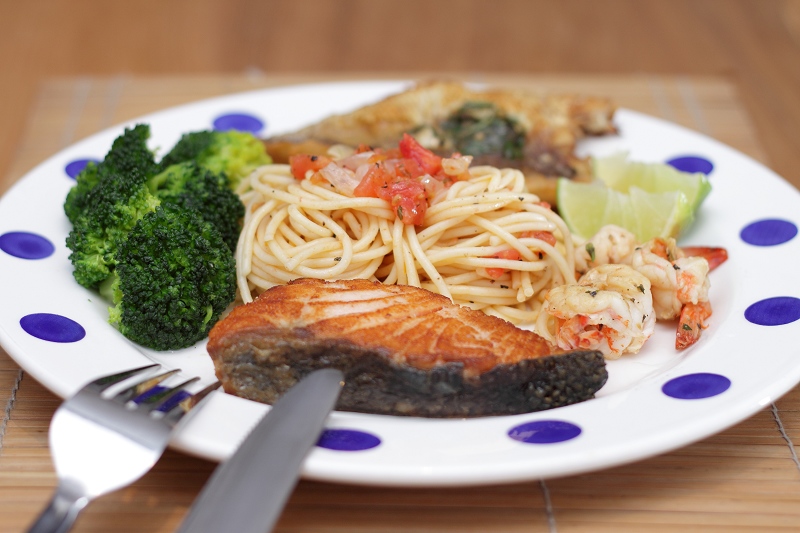
| Best of the plated meal entries. IMO, a little more contrast would push it up a notch. |
|
 Photographer found comment helpful. Photographer found comment helpful. |
|
|
08/02/2010 03:51:39 AM |
| I would have liked to have seen a little deeper depth of field on this one - the meal looks delicious! |
|
| Photographer found comment helpful. |
|
|
07/31/2010 04:17:26 PM |
| The green is a nice addition of colour into the image. I like it, but something feels a bit off...I think I would like to have seen it without the knife and fork. |
|
| Photographer found comment helpful. |
|
|
07/31/2010 09:22:05 AM |
| nice idea, i wish either the fork and knife or the last piece of food in the back was in focus...it would have made the picture 10 times better |
|
| Photographer found comment helpful. |
|
|
07/31/2010 09:12:22 AM |
| Between the numerous items of food, the pattern on the plate, and the silverware in the corner, this image is too busy. When shooting food, it is also good to brush melted butter or oil over the food so there are some highlights, which make food look tasty! |
|
| Photographer found comment helpful. |
|
|
07/30/2010 11:25:10 PM |
| looks great, wish the colors were a little more vibrant,but still a nice pic |
|
| Photographer found comment helpful. |
|
|
07/29/2010 05:06:26 PM |
Since folks in the forums complain about not getting comments, I'll offer this critique, so take it for what it's worth.
Generally, I like the image. It looks like you actually took time to prepare a good looking dish. However, the lighting looks just a bit flat. The fork and knife placed in front of the plate, in front of the salmon distracts from the main part of the meal. Also, since the salmon and the pasta are the main part of the meal, perhaps tilt/(spin) the plate slightly clockwise so that the salmon and the pasta are on the same plane to get/keep the salmon and pasta in focus with your shallow DOF. Not a deal breaker for the photo, but maybe get rid of the mat because the lines of the mat and the outline of the mat may be distracting to some. If you feel inclined to have the knife and fork in the picture, perhaps have them at the side of the plate (OOF) as an "accessory" item. Hope this helps (just one viewer's opinion). |
|
| Photographer found comment helpful. |
|
|
07/29/2010 03:16:20 PM |
| nice. I think a little more dof would have worked better here. |
|
| Photographer found comment helpful. |
|
|
07/28/2010 12:49:28 PM |
| Nice lighting and colors, silverware are distracting, 6 |
|
| Photographer found comment helpful. |
|
|
07/28/2010 12:28:46 PM |
| This looks good and is nicely photographed. A closer crop, and maybe removing the knife and fork would help this plate look even better. |
|
| Photographer found comment helpful. |
|
|
07/28/2010 08:59:38 AM |
| Nicely setup. Good job with perspective, lighting, and food prep. I kind of wonder if the utensils would have been even better on the right side, so that they balanced the photo (opposite the broccoli). |
|
| Photographer found comment helpful. |
|
|
07/28/2010 12:18:01 AM |
| Oh man... I knew I shouldnt have voted on this challenge on an empty stomach. |
|
| Photographer found comment helpful. |
|
|
07/28/2010 12:12:02 AM |
| looks very tasty, love the plate and cutlery. 8 |
|
| Photographer found comment helpful. |
Home -
Challenges -
Community -
League -
Photos -
Cameras -
Lenses -
Learn -
Help -
Terms of Use -
Privacy -
Top ^
DPChallenge, and website content and design, Copyright © 2001-2026 Challenging Technologies, LLC.
All digital photo copyrights belong to the photographers and may not be used without permission.
Current Server Time: 02/01/2026 06:59:41 AM EST.