| Author | Thread |
Comments Made During the Challenge  |
|
|
07/13/2004 12:21:21 PM |
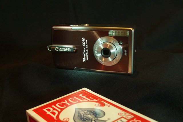
| Good idea, but connection between size and product is indistinct without caption |
|
 Photographer found comment helpful. Photographer found comment helpful. |
|
|
07/12/2004 02:53:41 PM |
|
| Photographer found comment helpful. |
|
|
07/11/2004 02:29:25 PM |
| NIce comcept - might be better without the glare |
|
| Photographer found comment helpful. |
|
|
07/10/2004 02:05:56 PM |
| The white on the deck of cards looks pretty yellow- like the whitebalance on the camera was set to daylight but the cards were illuminated with a tungsten light. |
|
| Photographer found comment helpful. |
|
|
07/08/2004 07:58:54 AM |
| Nice job. It does an effective job selling quality AND size, so very good tie in to the theme. Image seems a bit noisy to me. |
|
| Photographer found comment helpful. |
|
|
07/08/2004 02:07:19 AM |
| The idea might have been more effective if you actually showed the whole deck of cards. This lighting is too dark. |
|
|
|
07/07/2004 09:24:30 PM |
|
| Photographer found comment helpful. |
|
|
07/07/2004 10:06:16 AM |
| This is just wonderful. Many will crticize the cropping but I am comfortable as the eye has no other place to go. Perhaps a little sharper focus would have placed this image at the top of the heap. Good composition. |
|
| Photographer found comment helpful. |
|
|
07/07/2004 07:01:38 AM |
| This is a bit dark, the camera disappears on the left edge. Nice idea and execution, though. |
|
| Photographer found comment helpful. |
|
|
07/06/2004 09:57:38 PM |
| lol...great photo goodluck |
|
| Photographer found comment helpful. |
Home -
Challenges -
Community -
League -
Photos -
Cameras -
Lenses -
Learn -
Help -
Terms of Use -
Privacy -
Top ^
DPChallenge, and website content and design, Copyright © 2001-2025 Challenging Technologies, LLC.
All digital photo copyrights belong to the photographers and may not be used without permission.
Current Server Time: 04/07/2025 12:58:10 PM EDT.