| Author | Thread |
|
|
12/02/2002 07:55:00 PM |
Thanks muckpond, and everyone else who had nice things to say. Nice to know someone really liked it. Was going for big contrast and blew out the hand somewhat. Decided to have fun with the title. The background I couldn't do anything about. Will 'shop it out for my own finished one. Thanks.
PTLParsons...3 or 4 vs. 8 when considering a title...? not sure about that one. |
|
|
|
12/02/2002 07:14:00 PM |
CRITIQUE CLUB!!
I am soooooo excited that I got to critique this photo! It really was one of my favorites last week -- and one of very few 10s that I gave out.
Now that the fawning is out of the way.....
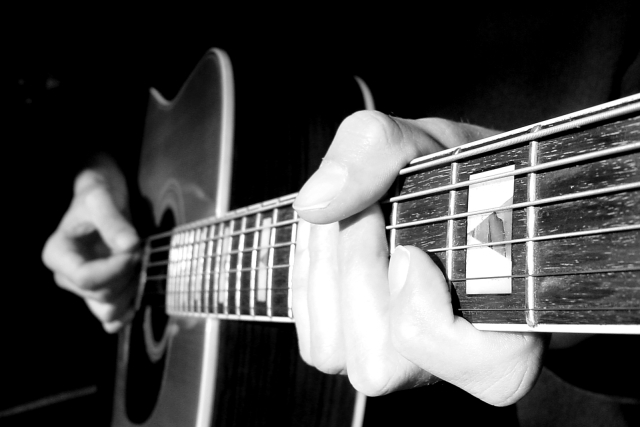
OK, we get it. The left hand is overexposed. Whether or not you were trying to do this, it probably does detract some from the photo. The lost detail in the hand is a definite contrast to the extreme detail in the guitar and rest of the photo. It doesn't bother me so much, but it was definitely a detriment to your score I'm sure.
The two things that I saw that stuck out at me were the background pieces. The line on the left (an amp cord?) and the bit on the right that looks like maybe part of a cuff or sleeve....the rest of the photo disappears so beautifully into the background that these are pretty noticeable and take focus away from the photo.
Composition is excellent. Photo is in perfect focus, the angle is just fantastic, and I don't care how many other shots have been taken like this -- this one was extremely well-done.
Congrats on a great photo. Sorry you placed so low.... Keep trying!
Rob 8) |
|
Comments Made During the Challenge  |
|
|
12/01/2002 06:16:00 PM |
| Brilliant focus and tones. I love the way shapes just randomly pop out of the blackness. Great job. The only thing I'm not sure I like is how abruptly the guitar ends on the bottom of the picture. |
|
|
|
12/01/2002 05:51:00 PM |
| Love the angle and DOF. Good job! |
|
|
|
12/01/2002 02:45:00 PM |
| I guess I've seen too many guitar shots in this angle in my time. I read the title, but I still think the left hand is too over exposed to be pleasing the eye. Jacko 6 |
|
|
|
12/01/2002 01:17:00 PM |
Great use of DOF. The lighting is a little strong on top, but still one of my favorites.
|
|
|
|
12/01/2002 02:47:00 AM |
| Clever title. I like the angle from which you've taken this one, sharp and blurred in all the right places. |
|
|
|
11/30/2002 06:11:00 PM |
|
|
|
11/30/2002 12:17:00 PM |
| Beautiful. The hand is soooo bright it loses some detail, but I absolutely love this photo. muckpond |
|
|
|
11/30/2002 07:07:00 AM |
| On topic. Trying to bridge the photo with a statement. Good. |
|
|
|
11/28/2002 02:41:00 PM |
| Article for a photography magazine? Article explaining some mistakes usually made by beginners? If that is the case the photo does well. And the mistakes are intentional to get a point across. That's what I'm going to assume, and you'll get an 8. If I'm wrong you know you don't deserve more that a 3 or 4. I think I'm right and it is a good shot. PTL8 I hope you let us know if I'm right. |
|
|
|
11/28/2002 09:06:00 AM |
| More illustrative than journalistic, but very nice. |
|
|
|
11/28/2002 03:35:00 AM |
| Those are really cool inlays. Definitely hi key. I like the way you can't see the person who is playing this guitar except his arms. I like the perspective on this pic to as far as the angle it was taken. It might not be a front page type shot, but I could see this pic on a page in the entertainment section or the weekend section. Good luck, Inspzil |
|
|
|
11/27/2002 10:30:00 PM |
| doesnt really work for this challenge... |
|
|
|
11/27/2002 07:27:00 AM |
| OK maybe the hand is overexposed a tad but I do like the strong contrast between the hand and the deep black background and the sweep of the neck of the guitar--well done andrewm |
|
|
|
11/27/2002 07:20:00 AM |
| I like guitars, and I wanna do a guitar shot sometime, but I can't find anywhere one fits into DPC. This one is incredibly well done, maybe a touch bright in the foreground. I don't see a lot of journalism or a story, but I do see a magazine cover, so you get credit there. 8 nards656 |
|
|
|
11/26/2002 09:04:00 PM |
|
|
|
11/26/2002 01:34:00 PM |
| Cool shot! B&W is very good. |
|
|
|
11/26/2002 09:04:00 AM |
| This is a neat photograph... by your title, i think you may have intentionally overexposed? if so, i think it was a wrong choice in my opinion... i don't see how it improves the image... For this to be 'photojournalistic', I would rather see the face of the person playing as well... it would make the story stronger... - setzler |
|
|
|
11/26/2002 08:49:00 AM |
| I can just see this in a magazine- nice work. :) Kaz |
|
|
|
11/26/2002 04:15:00 AM |
| Nicely titled. Don't like that chord :o) |
|
|
|
11/25/2002 02:16:00 PM |
I think you must have been going for this so this suggestion may be completely worthless but man that front hand is bright! I wish it was toned down just a tad so I could see more detail in the fingers and the rear hand was in focus as well.
Greg
|
|
|
|
11/25/2002 11:19:00 AM |
Fun title, works well! Good job. Nice B&W and love the perspective. GOOD going.
Justine |
|
|
|
11/25/2002 10:05:00 AM |
| Great concept! A shot I've seen in many underground music scene papers. Composition ~ I'm missing the bottom of the guitar. There was probably a reason you had to crop it out, but it is very distracting to me. Also (and this is a nitpick) I think it would have been a stronger shot if the left hand was actually fingering a chord... Exposure ~ From your title, I assume the blow out on the hand was intentional, but it doesn't work for me. Luckily (and I'm sure intentionally) it's not completely blown out and some detail is still there. Focus ~ Killer! You nailed it... I love the DOF you used here. ~ Myqyl ~ |
|
|
|
11/25/2002 05:43:00 AM |
| Great shot! Great title! Not sure it fits the challenge though... I dont think a shot like this would make make it in the newspaper. :o) 8 kosmik |
|
|
|
11/24/2002 08:40:00 PM |
| Loved this one, gave it a ten. |
|
Home -
Challenges -
Community -
League -
Photos -
Cameras -
Lenses -
Learn -
Help -
Terms of Use -
Privacy -
Top ^
DPChallenge, and website content and design, Copyright © 2001-2025 Challenging Technologies, LLC.
All digital photo copyrights belong to the photographers and may not be used without permission.
Current Server Time: 04/07/2025 12:06:48 AM EDT.