| Author | Thread |
Comments Made During the Challenge  |
|
|
07/13/2004 07:50:12 PM |
Very clever. You could work for an ad company. The photo itself looks just a bit flat though -- a boost to the color saturation would help.
Never mind -- I was looking at the photos on a monitor at work that definitely needs some work. On my home computer, the photo looks great. Sorry I only gave it an 8 -- it deserved more.
Message edited by author 2004-07-14 01:15:30. |
|
 Photographer found comment helpful. Photographer found comment helpful. |
|
|
07/13/2004 04:08:47 PM |
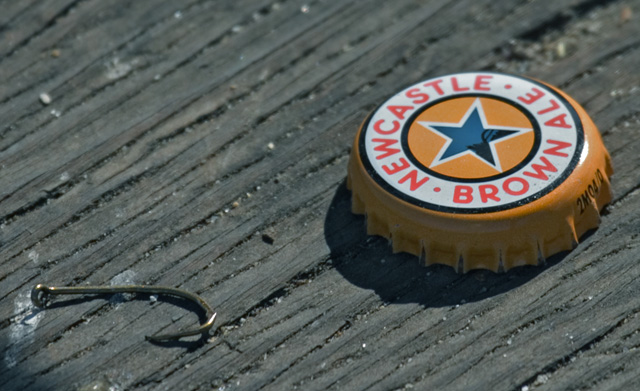
| Bonus points for featuring my favorite beer. |
|
| Photographer found comment helpful. |
|
|
07/13/2004 01:37:28 PM |
|
| Photographer found comment helpful. |
|
|
07/11/2004 10:11:24 AM |
| Very clever subject. Nicely executed. I found the short depth of field to be a little distracting, but that's a minor quibble. |
|
| Photographer found comment helpful. |
|
|
07/10/2004 01:22:39 AM |
|
| Photographer found comment helpful. |
|
|
07/09/2004 07:21:58 AM |
| I would have liked the hook leaning on the bottle cap better. Would have given the two items more of a connection. |
|
| Photographer found comment helpful. |
|
|
07/08/2004 04:31:17 PM |
| I love the simplicity of this. I would have liked to see the hook pierced through the bottle cap, but that's just a personal preference. |
|
| Photographer found comment helpful. |
|
|
07/08/2004 09:25:28 AM |
| Really effective! I think it would be better to show a frosty bottle alongside the cap, even if it is just the lower portion of the bottle (since the label is shown prominently on the bottle cap). Still, this is cleverness at its best and the composition is quite nice. There is a bit of shadow area in the corner below the hook. Also, maybe a bit more of the fishing line should be evident. As it is, it kind of looks like a found object. |
|
| Photographer found comment helpful. |
|
|
07/08/2004 07:44:52 AM |
|
| Photographer found comment helpful. |
|
|
07/08/2004 12:19:16 AM |
| Great title and Idea. I like the shot but think it will loose a few points because of the shadow on the cap and bottom left hand corner. DOF is slightly off as well. But great idea I like it. |
|
| Photographer found comment helpful. |
|
|
07/07/2004 01:02:27 PM |
| Good photo, the focus on the cap is a little off, maybe increase your aperature next time. The little shadow in the bottom left is a little distracting. |
|
| Photographer found comment helpful. |
|
|
07/07/2004 08:05:46 AM |
| Great idea. Great composition. I like the title/slogan. Perfect background. The wood has great texture. You should send to Newcastle. I can envision this in a magazine ad! This has to be a top contender. One of my favorites. |
|
| Photographer found comment helpful. |
|
|
07/07/2004 04:37:21 AM |
| That's a seriously good ad slogan. The picture is a bit dark and there's a reflection in the bottle cap, but i really like this as an advertisement. Nice job! |
|
| Photographer found comment helpful. |
|
|
07/06/2004 10:42:54 PM |
| Soft focus... I´d prefer to see it with a better focus. |
|
| Photographer found comment helpful. |
|
|
07/06/2004 08:56:03 PM |
| The compositon doesn't seem to sugest what the title implies, due to the fact that the elements (the hook and the cap) are competing for attention. |
|
| Photographer found comment helpful. |
Home -
Challenges -
Community -
League -
Photos -
Cameras -
Lenses -
Learn -
Help -
Terms of Use -
Privacy -
Top ^
DPChallenge, and website content and design, Copyright © 2001-2025 Challenging Technologies, LLC.
All digital photo copyrights belong to the photographers and may not be used without permission.
Current Server Time: 04/08/2025 01:30:01 AM EDT.