| Author | Thread |
Comments Made During the Challenge  |
|
|
07/13/2004 09:12:02 PM |
|
|
|
07/13/2004 08:10:14 PM |
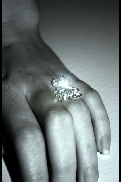
| Weird choice of cropping and glow spots. If it's an advertisement for the ring, I should be able to see it better. |
|
|
|
07/11/2004 03:04:13 PM |
| Her fingers should not be cropped. It looks odd and disturbing. |
|
 Photographer found comment helpful. Photographer found comment helpful. |
|
|
07/09/2004 05:50:20 PM |
| The main issue I have with this is the central placement of the subject. There are tutorials on the "rule of thirds" which would help you with the composition I think. Clearly this is a beautiful ring and it sure sparkles. But the sparkles are too hot. They wash out some of the detail. Subtle flashes of sparkle would be more effective. It looks like this was shot with the camera's flash. The dead on lighting hurts the effectiveless of the image. If your camera will allow, try natural light next time or a few softer lights rather than the camera's flash. Good luck. |
|
| Photographer found comment helpful. |
|
|
07/09/2004 12:48:35 PM |
| Nice concept, but the reflection and lack of detail in the ring really hurt this image as it is supposed to be the main focus of this image. |
|
|
|
07/08/2004 06:03:45 PM |
| Reflected light is a problem. Distracts from subject. |
|
|
|
07/07/2004 03:25:45 PM |
| To me this image does not show the jewelry in a way that makes it attractive to me, does not give justice to its beauty. Strange color, a blown out area and some lens flare. |
|
|
|
07/07/2004 10:00:28 AM |
| Sorry I really don't like this, maybe its the cropping. Maybe if the whole hand was in or a tighter crop on the ring not sure, the glare off the ring also takes out a lot of detail. Ohh looking again I get the feeling of a foot with really long toes, must be the angle of her wrist! |
|
|
|
07/07/2004 03:42:17 AM |
| i dont like the way the hand pose !, and the color cast make it look alien |
|
Home -
Challenges -
Community -
League -
Photos -
Cameras -
Lenses -
Learn -
Help -
Terms of Use -
Privacy -
Top ^
DPChallenge, and website content and design, Copyright © 2001-2026 Challenging Technologies, LLC.
All digital photo copyrights belong to the photographers and may not be used without permission.
Current Server Time: 02/01/2026 11:59:06 AM EST.