| Author | Thread |
|
|
12/01/2002 10:58:00 PM |
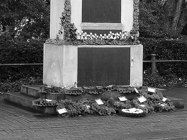
| Thanks for the comments. I was struggling a bit for an entry this week and took this crop from a picture of the whole monument. I should have kept the red poppies with the rest in B&W like I did in the pic at www.pbase.com/image/8096776 (which, apart from blurred background, is DPC legal) |
|
Comments Made During the Challenge  |
|
|
11/28/2002 08:16:00 PM |
| I know by the title what it is but the picture doesn't clearly depict the subject. IF you changed to a vertical perhaps more of the monument (?) could be seen to help clarify the subject. Grayce |
|
 Photographer found comment helpful. Photographer found comment helpful. |
|
|
11/28/2002 03:50:00 PM |
| Wish this were in color, what with the bricks and the green background. Would have made it come alive to you. Don't think you would have lost any of the sentiment. Now it is just drab and dark. My opinion is all. Other wise a fairly decent photo. Maybe a little too sharp. But still good. PTL6 |
|
| Photographer found comment helpful. |
|
|
11/28/2002 01:16:00 AM |
They shall not grow old,
as we who are left grow old.
Age shall not weary them,
nor the years condemn.
At the going down of the sun and in the morning,
we WILL remember them |
|
|
|
11/27/2002 04:52:00 PM |
| i'm personally not sure of who we're remembering here. Maybe the top of the memorial would tell me, or maybe you could have included some other clue. 5 nards656 |
|
|
|
11/27/2002 01:04:00 AM |
| Need a little more here. Something is missing. |
|
|
|
11/26/2002 04:12:00 PM |
| Nice shot, although the top crop and the overexposed cards and wreath hurt a little... Nice choice of BW ~ MyQyl ~ |
|
| Photographer found comment helpful. |
|
|
11/25/2002 11:52:00 AM |
| O' nice spot. Maybe the bottom (bricks) could of been left out and we could of seen more of the top. I also would of like to been a bit closer. Neat shot, good eye and on topic. Justine |
|
| Photographer found comment helpful. |
|
|
11/25/2002 08:36:00 AM |
| I would have prefered to see this in colour - we're missing out on all the reds here (you could even have desaturated all colours except red to highlight the poppies). A shot from straight on and closer in may also have helped. |
|
| Photographer found comment helpful. |
|
|
11/25/2002 07:26:00 AM |
| This picture would be better with a more dramatic angle. |
|
| Photographer found comment helpful. |
|
|
11/25/2002 05:11:00 AM |
Composition: Subject Placement, Cropping, Background6,
Technical: Focus, Exposure, Lighting, Processing5,
Appeal: Is it Interesting, Motivating, Etc.? 5,
Total Averaged Rating5. Autool
IMO the relationship between the title and picture are key elements in this challenge. Of what? I think that needs to be included to really tie it all together. Your picture seems to be overworked in post processing, losing much needed detail.
|
|
| Photographer found comment helpful. |
|
|
11/25/2002 04:24:00 AM |
| Perhaps moving in a little closer so as to have less foreground brick would make this composition a little stronger. Lighting, DOF and focus are good. |
|
| Photographer found comment helpful. |
Home -
Challenges -
Community -
League -
Photos -
Cameras -
Lenses -
Learn -
Help -
Terms of Use -
Privacy -
Top ^
DPChallenge, and website content and design, Copyright © 2001-2025 Challenging Technologies, LLC.
All digital photo copyrights belong to the photographers and may not be used without permission.
Current Server Time: 04/17/2025 03:58:34 PM EDT.