| Author | Thread |
Comments Made During the Challenge  |
|
|
05/09/2010 10:36:22 AM |
| Good! I like the creativity. |
|
 Photographer found comment helpful. Photographer found comment helpful. |
|
|
05/07/2010 02:03:46 AM |
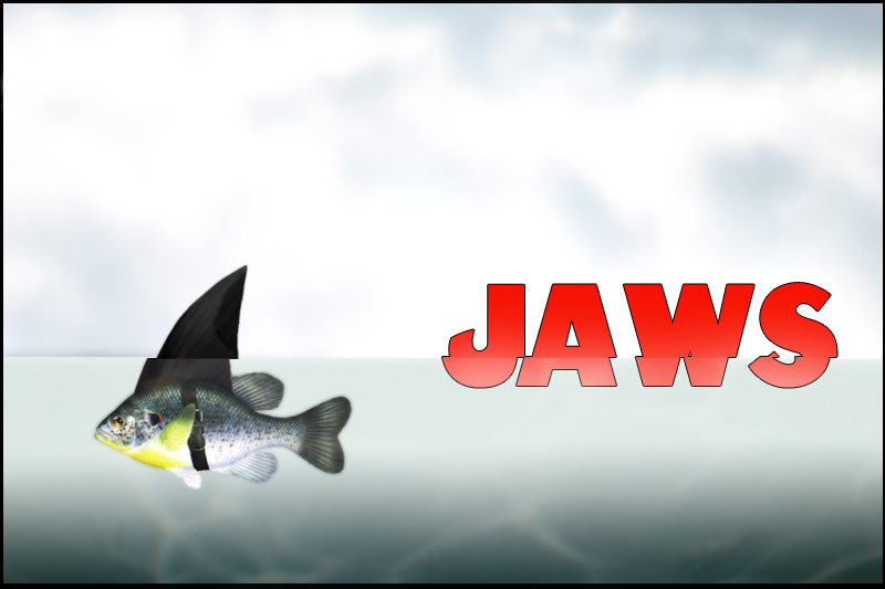
| Ha! Nice concept. I wonder though, if a subtle wave or ripple would have given it a little more coolness but I like what you did here. Now you seem to have gone out of your way to make it very unposter-like with the landscape and the border but for me they really don't bother me. What does (a little) is the black outline on the font. Actually it doesn't bother me. It's just dated and not in that hip-retro way either. Ok I said enough. Good luck. |
|
| Photographer found comment helpful. |
|
|
05/06/2010 11:18:54 PM |
|
| Photographer found comment helpful. |
|
|
05/06/2010 10:26:03 PM |
|
| Photographer found comment helpful. |
|
|
05/04/2010 02:46:49 PM |
|
| Photographer found comment helpful. |
|
|
05/03/2010 08:04:02 PM |
| Is that split and shift on purpose? Would have voted high if not for that. |
|
| Photographer found comment helpful. |
|
|
05/03/2010 08:32:30 AM |
|
| Photographer found comment helpful. |
|
|
05/03/2010 07:21:22 AM |
|
| Photographer found comment helpful. |
|
|
05/03/2010 01:17:24 AM |
| GREAT premise. But I wish you'd added more elements to make it look more like a movie poster. |
|
| Photographer found comment helpful. |
|
|
05/03/2010 12:21:20 AM |
|
| Photographer found comment helpful. |
|
|
05/03/2010 12:06:44 AM |
|
| Photographer found comment helpful. |
Home -
Challenges -
Community -
League -
Photos -
Cameras -
Lenses -
Learn -
Help -
Terms of Use -
Privacy -
Top ^
DPChallenge, and website content and design, Copyright © 2001-2026 Challenging Technologies, LLC.
All digital photo copyrights belong to the photographers and may not be used without permission.
Current Server Time: 02/01/2026 08:12:52 AM EST.