| Author | Thread |
Comments Made During the Challenge  |
|
|
07/07/2004 10:51:52 PM |
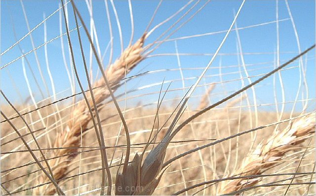
| Very nice subtle colors and it really is an extraordinary feat. You have a pretty serious overexposure problem here. |
|
 Photographer found comment helpful. Photographer found comment helpful. |
|
|
07/07/2004 09:57:02 PM |
| Seems a bit overexposed and over processed (too sharp) on this monitor. |
|
| Photographer found comment helpful. |
|
|
07/07/2004 02:59:41 AM |
| Gorgeous. I like the way you focus on just a few, yet allow us to sense the magnitude of the full fiel and the large appetite that is too be met by this crop. A 10. This is going on my list of favorites. |
|
| Photographer found comment helpful. |
|
|
07/06/2004 01:40:07 PM |
| Wheat, or is this oats?, are a fascinating subject. This image had a lot of potential. I'm afraid it is to bright, over exposed to be really effective. THe foreground element is not detailed enough, maybe it's just too under lit, to pull off being the star, which is what it's placement suggets it to be. The dof could work here with a little more light in the foreground, using different settings to not have the rest too bright, or possible some post processing work to alter the light - epxosure. Good effort. |
|
| Photographer found comment helpful. |
|
|
07/04/2004 07:15:50 PM |
| I like the subject, but am not wild about the composition. I think the length and shape of the grain could be used to strengthen the composition, maybe having some prevalent diagonals. There doesn't seem to be much form to the subject here, and imho, the more interesting subject is the taller strand to the left, though the focus is on the center. The exposure itself is good (though a little oversharpened). |
|
| Photographer found comment helpful. |
|
|
07/03/2004 11:49:52 AM |
| I don't particularly like the composition. I would have liked to see a bit more of the straw in front. |
|
| Photographer found comment helpful. |
|
|
07/03/2004 05:47:18 AM |
| There are a lot of jagged lines here, probably caused by resizing and sharpening too much. Try using a different resample method such as bicubic. ALso adding some contrast would give the image more "pop" |
|
| Photographer found comment helpful. |
|
|
07/02/2004 01:54:47 PM |
| Very nice, but a little light for my taste. The other weed photo scored a 10, this one a 9! (so you're in my top 15) |
|
| Photographer found comment helpful. |
|
|
07/01/2004 11:13:36 PM |
| good macro! Good concept. |
|
| Photographer found comment helpful. |
|
|
07/01/2004 01:42:30 PM |
| Nice shot. Would have liked the large strand in the foreground to be lit though. |
|
| Photographer found comment helpful. |
Home -
Challenges -
Community -
League -
Photos -
Cameras -
Lenses -
Learn -
Help -
Terms of Use -
Privacy -
Top ^
DPChallenge, and website content and design, Copyright © 2001-2026 Challenging Technologies, LLC.
All digital photo copyrights belong to the photographers and may not be used without permission.
Current Server Time: 02/01/2026 10:11:22 AM EST.