| Author | Thread |
Comments Made During the Challenge  |
|
|
07/10/2004 01:06:43 PM |
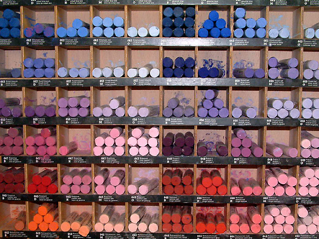
| this picture is too busy. the edges look distorted because of the distance |
|
 Photographer found comment helpful. Photographer found comment helpful. |
|
|
07/09/2004 08:42:56 PM |
| Great color mixture but it didn't grab me |
|
| Photographer found comment helpful. |
|
|
07/08/2004 05:23:55 PM |
| very nice idea....love the different hues of colors, including purple |
|
| Photographer found comment helpful. |
|
|
07/08/2004 02:35:29 AM |
| Interesting choice of subject matter. I think a border would help to define this image better. Also the flash glare near the top detracts from the image |
|
| Photographer found comment helpful. |
|
|
07/06/2004 05:59:22 PM |
| I really like this shot--from the idea to the composition. My only issues with it would be it seems like it could be straighter or more square and I'd like to see what it would have looked like with slightly less harsh lighting/shadows. |
|
| Photographer found comment helpful. |
|
|
07/06/2004 05:47:11 AM |
| Where's the purple? I know; The middle row. But I had to look for them... Since the challenge was 'the color purple' I would have tried to isolate your subject just a wee bit more. Just a thought :-) |
|
| Photographer found comment helpful. |
|
|
07/05/2004 10:36:41 AM |
| I really like the green chalk in another challenge seen recently... it did not make well (around 20 th), hope your will make better because i like it a lot !...., I am not sure about the flash ! seem a little harsh... maybe with a softbox next time ! a9 |
|
| Photographer found comment helpful. |
|
|
07/05/2004 07:03:02 AM |
| Either the shelf is warped or that's barrel distortion. Nice idea but image is a little too busy. If you could eliminate some of the unnecessary elements and zero more in on the "purpleness", your composition would've been stronger. |
|
| Photographer found comment helpful. |
|
|
07/04/2004 10:52:32 PM |
| Love the concept and the title - 7 |
|
| Photographer found comment helpful. |
Home -
Challenges -
Community -
League -
Photos -
Cameras -
Lenses -
Learn -
Help -
Terms of Use -
Privacy -
Top ^
DPChallenge, and website content and design, Copyright © 2001-2025 Challenging Technologies, LLC.
All digital photo copyrights belong to the photographers and may not be used without permission.
Current Server Time: 04/07/2025 01:07:03 PM EDT.