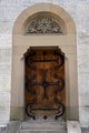
Greeting from the Critique Club!
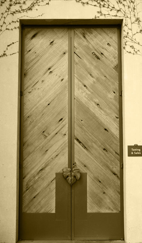
First Impression: Old, sepia, doors.. Nothing really grabbed me right away, this image requires a bit more thought.
Meeting the Challenge: It does indeed look like an entrance, a winery entrance at that :) So, now you need to report back in the comments section above, just how was the wine ;)
Composition: A very popular composition for this challenge it seemed... I've got to say, I didn't find this approach wonderful, but some of the voters really were looking for just this type of shot. I do like the inclusion of the sign to the right of the door, as it adds meaning to an otherwise fairly bland picture.
Subject: Again, it's more about the sign to me than the door, yes the door is nice, but that's not what really grabs my attention here, I'm drawn to that sign. The ivy is the second thing that my attention wanders to, and finally the grape leaf door handles are fairly interesting, and I suspect this might be the reason you chose this location for this challenge.
Technical: Flat - Good for racetracks, not so good for Champagne or photos.. The brown sepia tone is really no good for this subject, and the doors appear to lack any real detail (a shame! those doors were so wonderfully textured!)... I feel that this photo needed much more contrast and "pop", and it's a bit of a shame that it scored so low, as the subject itself was quite interesting. I think those technicals, plus the perspective issue mentioned by  oldbimmercoupe probably account for your placement in this challenge. oldbimmercoupe probably account for your placement in this challenge.
Final thoughts: Great choice of a subject (For reference to what a "bad" choice would have been, please see my entry in this challenge), and a decent execution. If you had chosen different PP you would have likely placed much higher. As I can see this is your first challenge entry, please do let me be the first to congratulate you on a great start, and I strongly suggest you read  scalvert's "how to win a ribbon" thread, as it will give you some pointers as to what makes for a winning photo here. scalvert's "how to win a ribbon" thread, as it will give you some pointers as to what makes for a winning photo here.
|