| Author | Thread |
Comments Made During the Challenge  |
|
|
04/07/2010 01:04:48 PM |
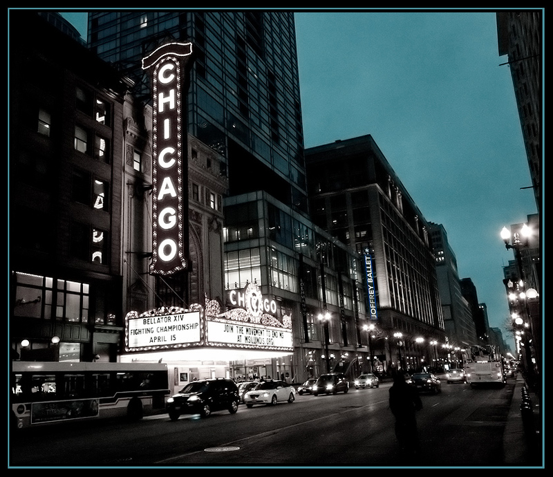
| Normally I'm not a fan of selective desat, but this is artistically and smartly done. |
|
 Photographer found comment helpful. Photographer found comment helpful. |
|
|
04/07/2010 03:11:55 AM |
| nice choice of selective desat, I like the sky color and how it matches the border |
|
| Photographer found comment helpful. |
|
|
04/06/2010 06:27:01 PM |
|
| Photographer found comment helpful. |
|
|
04/06/2010 06:45:03 AM |
| interesting edit, kinda works...I think it's ok overall 6 |
|
| Photographer found comment helpful. |
|
|
04/06/2010 06:36:36 AM |
| Nice 50's feel. The blue cast is perfect. Well done. 7 |
|
| Photographer found comment helpful. |
|
|
04/06/2010 05:05:48 AM |
| I like the marquee sign and the overall comp. The sky seems an unnatural blue/green. ??? Why not just go straight B&W? |
|
| Photographer found comment helpful. |
|
|
04/03/2010 10:43:03 PM |
| Great! Light+idea+execution! |
|
| Photographer found comment helpful. |
|
|
04/01/2010 04:08:55 AM |
| Great duotone with a very cool feeling. Not too keen on the frame though, which looks to be a bit wonky on one side and at the top. |
|
| Photographer found comment helpful. |
|
|
03/31/2010 09:17:46 PM |
| Hmmm...I almost want to see the lights on the sign in color but the rest of the picture with the coloring as you've presented it. |
|
| Photographer found comment helpful. |
Home -
Challenges -
Community -
League -
Photos -
Cameras -
Lenses -
Learn -
Help -
Terms of Use -
Privacy -
Top ^
DPChallenge, and website content and design, Copyright © 2001-2025 Challenging Technologies, LLC.
All digital photo copyrights belong to the photographers and may not be used without permission.
Current Server Time: 04/08/2025 11:20:20 AM EDT.