| Author | Thread |
|
|
04/11/2010 06:40:06 PM |
Greetings from the Critique Club!
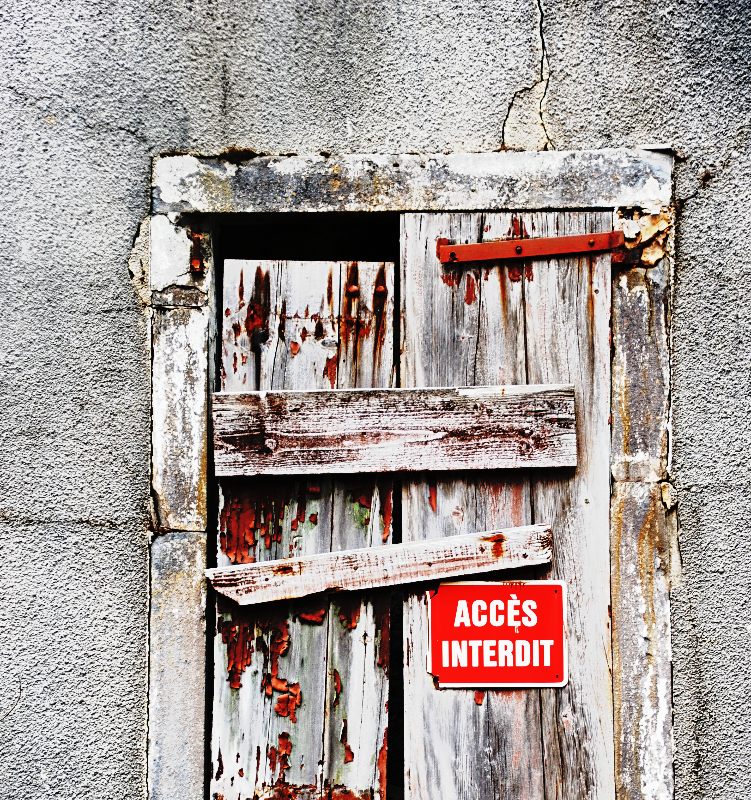
First off, this is my kind of shot, so I'm a bit partial to begin with. I see from your comments that I'm not the only one who likes shots like this. Great use of the color available - that red from the sign and the bits of peeled paint really pops! Also excellent job showing off the textures here. My only suggestion would be to crop a wee bit off the top - not really necessary but it balances it just a bit better perhaps. Nice work for this challenge!
If you have any questions, don't hesitate to PM me. |
|
 Photographer found comment helpful. Photographer found comment helpful. |
Comments Made During the Challenge  |
|
|
04/06/2010 07:29:33 PM |
| I love the rugged feel of this...really well done |
|
| Photographer found comment helpful. |
|
|
04/05/2010 06:06:25 PM |
| This is fabulous! I love the color and texture. It works! |
|
| Photographer found comment helpful. |
|
|
04/03/2010 11:35:28 AM |
| In my opinion this is a wonderful capture! |
|
| Photographer found comment helpful. |
|
|
04/03/2010 03:37:33 AM |
| Seems very contrasty and overbright. |
|
| Photographer found comment helpful. |
|
|
04/03/2010 12:16:13 AM |
| I like how the reds work together |
|
| Photographer found comment helpful. |
|
|
04/02/2010 06:45:08 PM |
| This makes me want to know what the backstory to it is - why was it condemned? By the weathered look the wood across the door it has been this way for quite awhile...The red French sign draws your eye in immediately and is echoed by the rust in the hinge and the peeling paint. Also the lumber texture contrasts nicely with the cracked rough stone around it. I do like this - and I want to know more. |
|
| Photographer found comment helpful. |
|
|
04/01/2010 08:36:18 AM |
| Geef hier uw commentaar, en vervolgens uw stem uit ... |
|
| Photographer found comment helpful. |
|
|
04/01/2010 07:14:39 AM |
| love how the red is so vivid |
|
| Photographer found comment helpful. |
|
|
03/31/2010 01:06:06 PM |
| Great use of minimal colour |
|
| Photographer found comment helpful. |
|
|
03/31/2010 06:58:09 AM |
| Seems a bit off-balance but this composition fits so well with its amazing textures!!! Great piece! |
|
| Photographer found comment helpful. |
|
|
03/30/2010 11:34:43 PM |
| I like the concept, but I think you've overdone the colors.. |
|
| Photographer found comment helpful. |
Home -
Challenges -
Community -
League -
Photos -
Cameras -
Lenses -
Learn -
Help -
Terms of Use -
Privacy -
Top ^
DPChallenge, and website content and design, Copyright © 2001-2025 Challenging Technologies, LLC.
All digital photo copyrights belong to the photographers and may not be used without permission.
Current Server Time: 04/07/2025 01:18:57 PM EDT.