| Author | Thread |
|
|
04/02/2010 10:55:52 PM |
Greetings from the Critique Club!
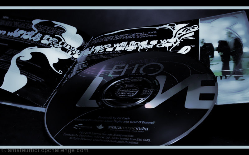
Hmm I thought you might have finished higher than this. I thought you had a rather well lighted subject with a clear idea of what you were selling. Love the way the colours all match. If there was one thing I would change that would be to include all of the CD. You included the most important parts in the picture but it's noticeable that the very bottom is excluded. All the best in future challenges!
If you have any questions click here to message me!
Senay |
|
 Photographer found comment helpful. Photographer found comment helpful. |
Comments Made During the Challenge  |
|
|
03/28/2010 12:57:40 PM |
| Interesting shot. Well done. |
|
| Photographer found comment helpful. |
|
|
03/26/2010 08:58:00 AM |
| Wonderful way to photograph a CD for sale. |
|
| Photographer found comment helpful. |
|
|
03/26/2010 04:30:14 AM |
| Great lighting and composition. One of my favorites. |
|
| Photographer found comment helpful. |
|
|
03/24/2010 03:04:18 PM |
| Composition seems a bit generic. Looks like a good CD, though. |
|
| Photographer found comment helpful. |
|
|
03/24/2010 03:18:35 AM |
|
| Photographer found comment helpful. |
|
|
03/22/2010 06:39:33 AM |
| A tough product to photograph, I think. Nice moodly light and tones. (Commenting only.) |
|
| Photographer found comment helpful. |
|
|
03/22/2010 03:17:22 AM |
| Good DOF and border choice. Not sure about the composition. |
|
| Photographer found comment helpful. |
|
|
03/21/2010 08:59:06 PM |
Nice choice of subject. Though I personally did not like the border here, it goes well with the colors scheme of the image.
Raj |
|
| Photographer found comment helpful. |
Home -
Challenges -
Community -
League -
Photos -
Cameras -
Lenses -
Learn -
Help -
Terms of Use -
Privacy -
Top ^
DPChallenge, and website content and design, Copyright © 2001-2025 Challenging Technologies, LLC.
All digital photo copyrights belong to the photographers and may not be used without permission.
Current Server Time: 04/07/2025 01:49:46 AM EDT.