| Author | Thread |
|
|
07/12/2004 04:28:46 AM |
Hello Kreg from the Critique Club,
Composition
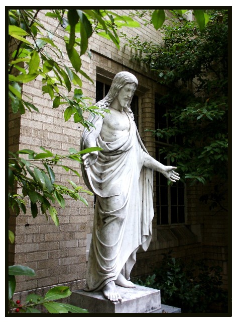
The statue is clearly your primary subject and I like the way the branches on the left and the trees on the right provide a frame. The camera position means the wall is sloping away form the viewer and this provides some interesting diagonal lines. Maybe the window behind the statue is a bit distracting but I'm not sure what you could have done about that. Maybe I would have cropped a little less on the bottom, to retain the whole of the plinth or at least the first step.
Focus
The statue itself is in focus - there is deep depth of field which is fine, although a wider aperture with consequently less depth of field might have softened the background to some advantage.
Exposure
Capturing white subjects in a generally dark background is always difficult. You have overexposed some of the statue, losing some highlight detail, which is a pity but had you reduced the light by smaller aperture or shorter exposure you would have lost details in the shadows. Maybe the statue was more important?
Challenge
This was a good subject for the challenge for those with the appropriate religious understanding (and convictions).
Overall
The religious theme will spark an interest from some of your audience - others may react against it. It is a very reasonable capture of the statue. Wander around some more and take your camera with you!
Hugh
Any comments or reactions, feel free to contact me. |
|
Comments Made During the Challenge  |
|
|
07/06/2004 08:45:29 AM |
| excellent title ... extraordinary man |
|
 Photographer found comment helpful. Photographer found comment helpful. |
|
|
07/03/2004 08:14:44 PM |
| Nice shot but the title seems trite - still, it's a great composition. - 7 |
|
| Photographer found comment helpful. |
|
|
07/03/2004 12:30:56 AM |
| stunning photo, good composition |
|
| Photographer found comment helpful. |
|
|
07/02/2004 09:33:32 PM |
|
| Photographer found comment helpful. |
|
|
07/02/2004 02:57:24 AM |
| Window in th ebackground distracts a bit. Maybe a little less DOF? |
|
| Photographer found comment helpful. |
|
|
07/01/2004 10:09:30 PM |
| good concept. The lighting could be better as the highlights seem a little blown. A different angle might have produced a more unteresting composition and provided a more uniform background. |
|
| Photographer found comment helpful. |
|
|
07/01/2004 07:56:42 PM |
| Agree with you on that one. |
|
| Photographer found comment helpful. |
|
|
07/01/2004 07:58:49 AM |
| This is cheating! If I give this photo a low score then I'm in Big Trouble with the Lord! just kidding, very nice shot. 10 |
|
| Photographer found comment helpful. |
|
|
06/30/2004 11:21:25 AM |
| Well if it was the real thing then..... |
|
| Photographer found comment helpful. |
|
|
06/30/2004 03:56:10 AM |
| its only extroardinary if your religious. in my opinion this does not fit the challenge. I also think it would have looked better with a tighter crop on the sides and a little on the top. |
|
| Photographer found comment helpful. |
|
|
06/29/2004 08:47:11 PM |
| Clever concept and well executed photo! |
|
| Photographer found comment helpful. |
Home -
Challenges -
Community -
League -
Photos -
Cameras -
Lenses -
Learn -
Help -
Terms of Use -
Privacy -
Top ^
DPChallenge, and website content and design, Copyright © 2001-2025 Challenging Technologies, LLC.
All digital photo copyrights belong to the photographers and may not be used without permission.
Current Server Time: 04/07/2025 12:48:20 PM EDT.