| Author | Thread |
Comments Made During the Challenge  |
|
|
07/04/2004 10:26:35 PM |
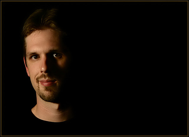
Lighting: Good, with an expressive catchlight.
Pose: works well.
Background: perfect. Love how the shadows fall into it. |
|
 Photographer found comment helpful. Photographer found comment helpful. |
|
|
07/03/2004 08:57:01 PM |
| Exceedingly well done. Great lighting. |
|
| Photographer found comment helpful. |
|
|
07/03/2004 02:10:05 PM |
| I'd like to know your motivation for the negative space ... it works OK but I don't immediately see the purpose of it. With the lighting and exposure you have, you could crop this in half and have a very nicely-rendered "typical" portrait -- maybe that's reason enough for the treatment you gave it. |
|
| Photographer found comment helpful. |
|
|
07/03/2004 11:08:59 AM |
Love the low key effect and neg. space! Great lighting. I gotta figure out how to do the catchlight thing...
TC |
|
| Photographer found comment helpful. |
|
|
07/02/2004 06:23:12 PM |
| I like this, but don't understand the negative space on the right, but the rest is quite good. |
|
| Photographer found comment helpful. |
|
|
07/02/2004 12:14:14 PM |
| Very nice...but just a tad dark on my monitor... Like the use of negative space. It's very effective in this instance. Well done. :o) |
|
| Photographer found comment helpful. |
|
|
07/01/2004 08:43:13 PM |
| Nice... I like it... good use of empty space.. great use of lighting. Very well done... Now step over to the dark side ;-). J/K... -10- |
|
| Photographer found comment helpful. |
|
|
07/01/2004 07:17:42 AM |
| really like the use of light and shadows here |
|
| Photographer found comment helpful. |
|
|
06/30/2004 10:20:11 PM |
| I like the negative space and the lighting you used in this shot. It adds quite a bit of emotion. I might have cropped a little more of the negative space but this is a might nice shot. |
|
| Photographer found comment helpful. |
|
|
06/30/2004 05:40:58 PM |
| Good use of negative space. |
|
| Photographer found comment helpful. |
|
|
06/30/2004 12:24:57 PM |
| I really like this photo. Maybe just sharpen a bit. |
|
| Photographer found comment helpful. |
|
|
06/29/2004 11:52:02 PM |
| like the strong side light but especially the black background and the of center placement |
|
| Photographer found comment helpful. |
|
|
06/29/2004 11:48:44 PM |
| I think this is a nice portrait, however the lighting seems a blit too dark. His head fades into the background. I like the overall dark tone to the photo, but would prefer to be able to make out the features on the left side of his (your?) face. The black t-shirt makes it look as if it's a mannequin's head - no body. :) |
|
| Photographer found comment helpful. |
|
|
06/29/2004 10:07:15 PM |
| Captivating image with great use of negative space. Border doesn't help. Model is perfect. |
|
| Photographer found comment helpful. |
|
|
06/29/2004 09:37:34 PM |
| The negative space at right doesn't do much for me here. |
|
| Photographer found comment helpful. |
|
|
06/29/2004 06:13:42 PM |
| good use of a third well lit |
|
| Photographer found comment helpful. |
|
|
06/29/2004 05:33:17 PM |
|
| Photographer found comment helpful. |
|
|
06/29/2004 01:07:35 PM |
| I tried the same effect and failed, very good, 9 |
|
| Photographer found comment helpful. |
|
|
06/29/2004 08:53:57 AM |
| A brave approach to leave so much negative space in the image, I like that idea but it may just be too much for some. I also like the lighting and that little touch of light on the left cheek is perfect. |
|
| Photographer found comment helpful. |
|
|
06/29/2004 07:23:19 AM |
| Great use of negative space, and a great portrait in general. I love the lighting. |
|
| Photographer found comment helpful. |
|
|
06/29/2004 02:56:56 AM |
| The negative space is a bit overdone for me - otherwise a nice portrait. |
|
| Photographer found comment helpful. |
|
|
06/29/2004 12:05:22 AM |
| I would have desaturated the lips a bit and would have allowed the light a slight shift to remove the visible part of the left bottom lip. Otherwise, it has a great visual appeal. very good composition. |
|
| Photographer found comment helpful. |
|
|
06/28/2004 10:18:19 PM |
|
| Photographer found comment helpful. |
|
|
06/28/2004 10:09:41 PM |
Negative space is on the wrong side, now looks like wasted space.
Good capture, though. |
|
| Photographer found comment helpful. |
|
|
06/28/2004 06:12:48 PM |
I like this style of photography
Good luck |
|
| Photographer found comment helpful. |
|
|
06/28/2004 06:06:53 PM |
| Nicely done. Good luck in the challenge, hope this one does well. |
|
| Photographer found comment helpful. |
|
|
06/28/2004 04:38:08 PM |
|
| Photographer found comment helpful. |
|
|
06/28/2004 03:24:05 PM |
| Of all the portraits in this challenge, this is the one that I come back to often. Composition and lighting are just exquisite ... I love that the shadows and shirt blend with the background and that the left eye is not under the shadows (seen a lot of these with what I call raccoon eyes). On the other hand, I just wished you used another model just because you're so recognizable now :-) ... no offense meant because you're an attractive model but the recognition factor might turn off some readers and give you a low score because you just won recently... wonderful job ... I hope to follow your set up someday. |
|
| Photographer found comment helpful. |
|
|
06/28/2004 02:56:58 PM |
| I like the dead space, but the shadow cast by the nose is a little bit too dark and washes away alot of the face. Perhaps a little more light on the right side would have helped it (reflector maybe). Nice Job. |
|
| Photographer found comment helpful. |
|
|
06/28/2004 02:31:06 PM |
| Well done, perfect background and lighting...but then you are a pro... :) |
|
| Photographer found comment helpful. |
|
|
06/28/2004 08:16:45 AM |
| the big part pure black is bothering me. I think I would have liked a closer crop. |
|
| Photographer found comment helpful. |
|
|
06/28/2004 08:06:59 AM |
| I'm not sure but I think I would have liked the head on the right side of the photo instead of the left. But good lightning. |
|
| Photographer found comment helpful. |
|
|
06/28/2004 04:27:35 AM |
|
| Photographer found comment helpful. |
|
|
06/28/2004 02:23:32 AM |
| Interesting shot, nice creative touch with the empty space and the darkness. I guess I think the title is not very apt. |
|
| Photographer found comment helpful. |
|
|
06/28/2004 01:45:51 AM |
| nice composition and use of black t-shirt. |
|
| Photographer found comment helpful. |
Home -
Challenges -
Community -
League -
Photos -
Cameras -
Lenses -
Learn -
Help -
Terms of Use -
Privacy -
Top ^
DPChallenge, and website content and design, Copyright © 2001-2026 Challenging Technologies, LLC.
All digital photo copyrights belong to the photographers and may not be used without permission.
Current Server Time: 02/01/2026 10:10:31 AM EST.