| Author | Thread |
|
|
03/11/2011 10:49:38 AM |
| so cool, what a great shot, title is perfect as well |
|
 Photographer found comment helpful. Photographer found comment helpful. |
|
|
03/14/2010 05:13:14 PM |
Greetings from the Critique Club.
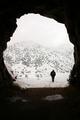
First impressions are that the Giraffe is lost in all those lines.
Technically this is ok. Composition is good and I'm a fan of shots where the subject is only a small part of the frame. I agree with some voters that the hue is quite unnatural. The lighting looks like it was in full sun - hence the monotone?
Artistically I like the small in frame concept. I'd like to have the Giraffe's head not in the hole as the Giraffe looks a little awkward like he is. Given the advanced editing rules I'd have cloned a couple of distractions from the fence that seem to be attention grabbers.
In summary a cool shot but an unusual toning.
Feel free to PM me if you have any queries.
Gerry |
|
| Photographer found comment helpful. |
|
|
03/08/2010 02:59:12 AM |
| I had to look at the comments on this one to see what people thought, and I agree. It's one of those shots that would be right at home in Nat'l Geo, or a fine art mag. |
|
| Photographer found comment helpful. |
Comments Made During the Challenge  |
|
|
03/05/2010 04:57:12 PM |
| This is goes into my fantasy Posthumous Art Gallery. |
|
| Photographer found comment helpful. |
|
|
03/03/2010 04:19:32 AM |
| Awww! Like the perspective; that is one HUGE fence. |
|
| Photographer found comment helpful. |
|
|
03/02/2010 06:45:48 PM |
| Awesome subject, although I'm not crazy about the reddish hue. More b/w might have served this image better. |
|
| Photographer found comment helpful. |
|
|
03/01/2010 04:41:35 PM |
|
| Photographer found comment helpful. |
Home -
Challenges -
Community -
League -
Photos -
Cameras -
Lenses -
Learn -
Help -
Terms of Use -
Privacy -
Top ^
DPChallenge, and website content and design, Copyright © 2001-2025 Challenging Technologies, LLC.
All digital photo copyrights belong to the photographers and may not be used without permission.
Current Server Time: 04/08/2025 01:48:21 AM EDT.