| Author | Thread |
Comments Made During the Challenge  |
|
|
07/04/2004 06:28:19 PM |
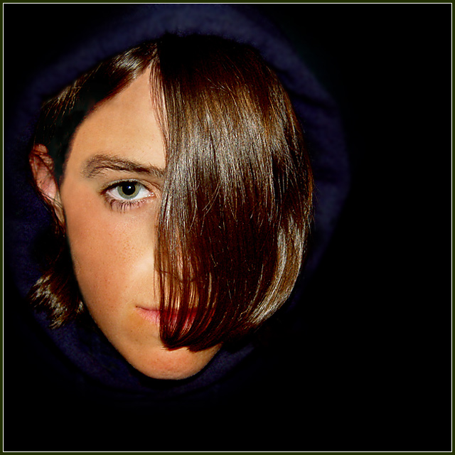
Lighting: well balanced, but perhaps just a tad harsh.
Pose: conveys the message well.
Background: wonderful. |
|
 Photographer found comment helpful. Photographer found comment helpful. |
|
|
07/03/2004 10:00:25 PM |
This takes me back to the late 80's. I never could do this haircut, my hair is too waivy. Very Thompson Twins though. Great lighting. Love the catch light in the visible eye!
TC |
|
| Photographer found comment helpful. |
|
|
07/03/2004 05:07:19 PM |
| I like the concept you were going for here; however the lighting is a little hard and something just does not look right about the eyes. |
|
| Photographer found comment helpful. |
|
|
07/03/2004 10:19:09 AM |
| Interesting idea; it's so close now I think I'd crop it square -- unless you deliberately want to introduce that additional element of oddness. |
|
| Photographer found comment helpful. |
|
|
07/02/2004 08:35:47 AM |
|
| Photographer found comment helpful. |
|
|
07/02/2004 08:17:35 AM |
| Effective lighting and focus is very sharp. I also like the off-center composition. Well done. :o) |
|
| Photographer found comment helpful. |
|
|
07/02/2004 02:30:28 AM |
| The choice of dark blue hood against the pure black background provides a very subtle but nice frame. I like it. |
|
| Photographer found comment helpful. |
|
|
07/01/2004 09:58:56 AM |
| Though a little strong on the flash, I like the way you've isolated the head of your subject with dark clothing and background. |
|
| Photographer found comment helpful. |
|
|
07/01/2004 04:11:32 AM |
| im so glad we had a portrait challenge, which i did enter with my first attempt. I have learned alot about being creatve, lighting and backround from shots like this one. sorry if i cant help with suggestions on how to make this better. |
|
| Photographer found comment helpful. |
|
|
06/30/2004 01:40:20 PM |
| the background and sweatshirt / clothing is all too black - makes the head seem a bit disembodied. there doesn't also appear to be any reason for the off-centre compositon - kids appearance is largely spherical, and a centred composition might work better. picture overall appears a bit weird, and the fringe is not particular portrait-friendly. |
|
| Photographer found comment helpful. |
|
|
06/30/2004 09:47:29 AM |
| So much hair in front of her face is distracting to me. Awesome color eye ... kinda wish she was smiling. |
|
| Photographer found comment helpful. |
|
|
06/29/2004 10:33:55 PM |
| Wow! Your model's face is stunning! The background works very well but I am not happy with the blue boder that surrounds her head. Lighting = well done. Border = not needed. |
|
| Photographer found comment helpful. |
|
|
06/29/2004 07:58:31 PM |
| I think this is a nice portrait, however the lighting seems a blit too dark. The hat fades into the background. |
|
| Photographer found comment helpful. |
|
|
06/29/2004 03:14:02 PM |
| Nice pose, interesting idea, good non-distracting background...But the lighting is too harsh, lots of distracting reflections on the hair. |
|
| Photographer found comment helpful. |
|
|
06/29/2004 02:17:57 PM |
| hair doesnt work for me,sorry |
|
| Photographer found comment helpful. |
|
|
06/29/2004 01:36:25 PM |
| What's that blue stuff around her head? Need some lighting. |
|
| Photographer found comment helpful. |
|
|
06/29/2004 01:02:51 PM |
| It's not a "traditional studio portrait". I think that will draw down your score.... your subject is pretty... hair is interesting... just not "traditional". |
|
| Photographer found comment helpful. |
|
|
06/29/2004 09:43:34 AM |
| I like the premise of this. The hair covering the other eye is a tad distracting, especially with the light reflecting off of it |
|
| Photographer found comment helpful. |
|
|
06/29/2004 07:25:07 AM |
| she seems to have a floating head, and the skin tones don't seem natural, don't really care for her hair to be covering this much of her face |
|
| Photographer found comment helpful. |
|
|
06/29/2004 07:05:50 AM |
| I realy don't like this picture, it's just not for me I guess. I don't get it. |
|
| Photographer found comment helpful. |
|
|
06/28/2004 06:05:32 PM |
|
| Photographer found comment helpful. |
|
|
06/28/2004 05:45:01 PM |
Youth would see better with both eyes open.
If negative space was on the left, image would have more balance. I think Rule of Thirds doesn't work in most studio portraits.
Good exposure. |
|
| Photographer found comment helpful. |
|
|
06/28/2004 12:09:27 PM |
good image
your model has a cheeky smile on her face
good luck |
|
| Photographer found comment helpful. |
|
|
06/28/2004 10:50:10 AM |
| Interesting. I can't tell if this is an adolescent girl or boy. What I dislike is the rather disembodied appearance of the head and the crescent of blue-ish light just over the subject's head. It might be a hat--it's really hard to make out what it is---but it has the effect of flattening the top of the subject's head. |
|
| Photographer found comment helpful. |
|
|
06/28/2004 08:23:43 AM |
| i don't know why, but this picture gives me an uneasy feeling. It's very dark and surreal. |
|
| Photographer found comment helpful. |
|
|
06/28/2004 06:49:40 AM |
| Unique and I like it. The light could of been toned down a little but this works for me. Good entry. |
|
| Photographer found comment helpful. |
Home -
Challenges -
Community -
League -
Photos -
Cameras -
Lenses -
Learn -
Help -
Terms of Use -
Privacy -
Top ^
DPChallenge, and website content and design, Copyright © 2001-2025 Challenging Technologies, LLC.
All digital photo copyrights belong to the photographers and may not be used without permission.
Current Server Time: 04/07/2025 01:03:04 PM EDT.