| Author | Thread |
Comments Made During the Challenge  |
|
|
11/23/2002 04:24:00 PM |
| I feel that the vertical lines caused by the item visually separates this image into too many sections. perhaps a slighly different angle to see the mechanics without slicing the image would have helped. |
|
|
|
11/23/2002 12:09:00 PM |
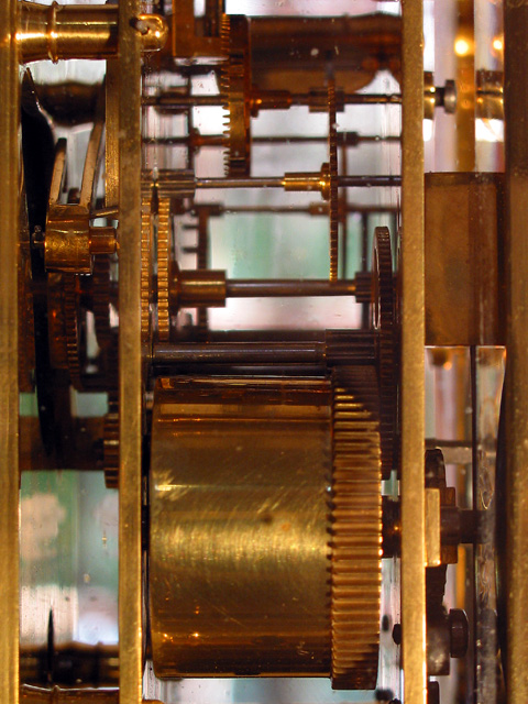
| You got most of us I bet. Is this the insides of a clock? Time machine is right. Unique idea and well executed. Decent focus. Crop a little tight but emphasized what you wanted. Composition is great. Light is just a little dark, but not so much to really hurt the shot. Great photo and one of a kind. Really like the idea. PTL |
|
|
|
11/20/2002 01:23:00 AM |
| Interesting picture. I found the background and reflections distracting. Could have been a bit sharper too. |
|
|
|
11/19/2002 11:42:00 PM |
| The shallow DOF really isn't helping this picture at all. A very small portion of this picture is actually really focused leaving most of the picture slightly out of focus, or more than slightly. The lighting is not great either. Good Luck - Inspzil |
|
|
|
11/19/2002 08:02:00 PM |
Not a bad idea. Work with the light and the focal points a little more. Bring out the depth. Make it three D
|
|
|
|
11/18/2002 04:18:00 PM |
|
|
|
11/18/2002 01:30:00 PM |
| Nice title, but the lighting could be better. |
|
|
|
11/18/2002 12:25:00 PM |
| Excellent idea, and a well-done photo. The background distracts somewhat, but the color and sharpness of the clock innerds are excellent. |
|
|
|
11/18/2002 04:22:00 AM |
|
|
|
11/18/2002 01:50:00 AM |
| Needs a little sharper focus. |
|
|
|
11/17/2002 11:57:00 PM |
| Nice shot. I think it might have been better if we could only see the clock parts and not the out of focus background. |
|
|
|
11/17/2002 07:57:00 PM |
Technically correct , exposure, focus, saturation , contrast. 6
Good composition. 7
Tells a story or creates a mood
Impact to the viewer
Relevance to the Challenge 10
Overall 7
sulamk
|
|
|
|
11/17/2002 07:42:00 PM |
|
Home -
Challenges -
Community -
League -
Photos -
Cameras -
Lenses -
Learn -
Help -
Terms of Use -
Privacy -
Top ^
DPChallenge, and website content and design, Copyright © 2001-2025 Challenging Technologies, LLC.
All digital photo copyrights belong to the photographers and may not be used without permission.
Current Server Time: 04/07/2025 12:45:43 PM EDT.