| Author | Thread |
|
|
02/21/2010 09:28:00 AM |
Greetings from the Critique Club.
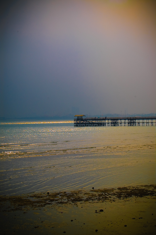
First impressions are that the colours seem a little unnatural and the halves of the frame seem a little uninteresting.
Technically there are a few things here that could be changed to help the shot score better. First, the subject is in the middle of the frame - remember the rule of thirds and if you are going to break the rule just ask yourself if doing so helps the shot. Second, I wonder if those tones are natural - they may be but I'm sure a few voters wondered. Third, the empty space of the sky and the beach doesn't add to the shot so perhaps make this a landscape shot and emphasize one or the other.
Artistically this is not bad. I like the graduation in the sky and the general concept is good.
In summary the technical elements let this shot down. There is also a lack of relationship to the challenge - if the voters don't see it meet challenge in an obvious way then they often knock a point off.
Feel free to PM me if you have any queries.
Gerry |
|
Comments Made During the Challenge  |
|
|
02/16/2010 04:47:37 PM |
| Nice tones. The side on shot of the pier does not give me a great feeling of perspective though. |
|
 Photographer found comment helpful. Photographer found comment helpful. |
|
|
02/16/2010 07:43:05 AM |
| Lovely image with nice perspective. I do feel there's too much empty sky though and feel that this image would be more effective if you cropped from the top down so that the horizon would be in the two thirds position instead of in the middle as it is now. 6 |
|
| Photographer found comment helpful. |
|
|
02/15/2010 04:29:46 AM |
| not a very unique perspective but a beautiful shot |
|
| Photographer found comment helpful. |
|
|
02/14/2010 10:02:56 PM |
| Very subtle and minimalist. I like! The vignetting hurts. |
|
| Photographer found comment helpful. |
|
|
02/13/2010 10:38:22 AM |
| a pretty shot tho i dont know that it is a perspective that adds much to the impact of the shot |
|
| Photographer found comment helpful. |
|
|
02/13/2010 09:45:23 AM |
| Sorry but for me this doesn't seem to portray a different or unique perspective. The colors also seem a bit off. |
|
| Photographer found comment helpful. |
|
|
02/13/2010 08:57:27 AM |
|
| Photographer found comment helpful. |
|
|
02/12/2010 12:55:24 PM |
| very nice colors and light, but I think I would have preferred a horizontal.....a lot of dead space |
|
| Photographer found comment helpful. |
|
|
02/11/2010 10:46:25 AM |
| This is beautiful and I love your color pallet. You have multiple levels of interest in the different horizontal subjects. Very pretty. |
|
| Photographer found comment helpful. |
|
|
02/11/2010 08:09:05 AM |
| I can't see how the perspective dramatizes this photo. |
|
| Photographer found comment helpful. |
Home -
Challenges -
Community -
League -
Photos -
Cameras -
Lenses -
Learn -
Help -
Terms of Use -
Privacy -
Top ^
DPChallenge, and website content and design, Copyright © 2001-2025 Challenging Technologies, LLC.
All digital photo copyrights belong to the photographers and may not be used without permission.
Current Server Time: 04/12/2025 10:41:55 AM EDT.