| Author | Thread |
Comments Made During the Challenge  |
|
|
06/29/2004 12:36:18 AM |
maybe a little wider crop
newspaper would want to give more perspective on area
IMO |
|
 Photographer found comment helpful. Photographer found comment helpful. |
|
|
06/27/2004 12:31:05 AM |
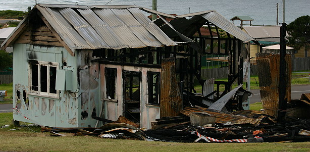
| I really like this. Its simple and well done. |
|
| Photographer found comment helpful. |
|
|
06/26/2004 07:43:14 PM |
|
| Photographer found comment helpful. |
|
|
06/24/2004 05:14:35 PM |
| I enjoy how this shot looks "painted" almost. Probably a lot nicer than photos in the paper! I would love to see the original and see what cropping you did. It absolutely works this way, but there may be other great ways to present this also. If I had to fault the shot at all, I would say that there is no one strong point of "interest", so it doesn't "grab" you as easily. |
|
| Photographer found comment helpful. |
|
|
06/23/2004 03:12:19 PM |
| I think a close up of the window frame or door and inside would have been more "powerful" for the title. This is quite a busy photo and really just makes the house look old and dilapidated - not "just burnt down!". |
|
| Photographer found comment helpful. |
|
|
06/23/2004 06:31:06 AM |
| Lighting doesn't look to great in this photo. Colors are a bit dull. |
|
| Photographer found comment helpful. |
|
|
06/23/2004 03:56:11 AM |
| Good photo. Good headline. Nicely done. |
|
| Photographer found comment helpful. |
Home -
Challenges -
Community -
League -
Photos -
Cameras -
Lenses -
Learn -
Help -
Terms of Use -
Privacy -
Top ^
DPChallenge, and website content and design, Copyright © 2001-2026 Challenging Technologies, LLC.
All digital photo copyrights belong to the photographers and may not be used without permission.
Current Server Time: 02/01/2026 11:43:41 AM EST.