| Author | Thread |
|
|
02/21/2010 04:24:36 PM |
| Great commentary very helpful!!!!! |
|
|
|
02/21/2010 02:56:38 PM |
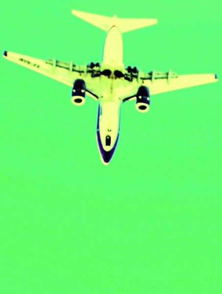
Greetings from the Critique Club ;)
Artistic Merit
Pros:
* Good subject placement, gives us a clear view of it's evolution.
* Interesting and unusual perspective.
Cons:
* The crop is just too tight. The subject has very little space to "breathe".
* It's too aligned with the frame and thus too "stable". Such a photo would benefit a lot from more more dynamic lines and I think a an angular approach works better.
Technical Merit
Cons:
* Sharpness and focus are compromised. With the kind of equipment you were using you should have gotten away easily with a much faster shutter speed without compromising IQ, either by opening up the lens or raising ISO or both. The subject speed required it and you had still had plenty of play.
Emotional Merit
Pros:
* This crossprocessing turned a boring plane picture into something interesting. Quite Warhol-ish as  bcenu has put it. bcenu has put it.
Cons:
* Unfortunately your choice of colors wasn't the best IMHO. There are only cold colors in this picture and these don't convey the kind of energy expected from such a subject. Complementary colors would have given this picture more punch.
Result
It's interesting to see that similar pictures could get get you from first place:  to middle ground to middle ground  or bottom of the pack in your case. I voted your picture 5* and 7* on the others, but looking at their placement it's more or less obvious what you got wrong and what they got right. or bottom of the pack in your case. I voted your picture 5* and 7* on the others, but looking at their placement it's more or less obvious what you got wrong and what they got right.
My take from the comments is that the coloring was missfortunate with the focus/sharpness hitting hard in second.
Keep them coming and don't let those less achieved photos let you down. You are bound to get better.
All the best
Duarte Bruno |
|
 Photographer found comment helpful. Photographer found comment helpful. |
Comments Made During the Challenge  |
|
|
02/16/2010 06:41:50 PM |
| Looks a bit Andy Warhol-ish. Good effect and perspective. |
|
|
|
02/16/2010 07:56:22 AM |
| No perspective here and really horrible colors. Don't get the title either. 4 |
|
|
|
02/15/2010 04:05:31 AM |
| strange PP and lack of focus take away from this shot |
|
|
|
02/13/2010 01:46:59 PM |
| too over processed for my tastes, a green sky is not appealing |
|
|
|
02/12/2010 09:57:24 AM |
| What happened to the colors? I'm sorry but this is not nice to look at imho. You def took a different perspective though so maybe I am just missing it. |
|
|
|
02/12/2010 09:11:31 AM |
| I'm not really into the color here |
|
|
|
02/12/2010 06:22:03 AM |
| Through the tinted glasses of Johnny Depp! Good idea, could possibly have been a bit sharper. |
|
|
|
02/12/2010 04:34:23 AM |
| This looks like a shot out of the movie Oceans Eleven or something. TYpically this type of processing is over done for DPC but here it looks pretty cool. Nice perspective from the ground up! |
|
|
|
02/11/2010 06:36:01 AM |
| I think another way of pp would have been better. Green sky, yellow airplane... "slightly" over the edge to my personal taste. |
|
Home -
Challenges -
Community -
League -
Photos -
Cameras -
Lenses -
Learn -
Help -
Terms of Use -
Privacy -
Top ^
DPChallenge, and website content and design, Copyright © 2001-2025 Challenging Technologies, LLC.
All digital photo copyrights belong to the photographers and may not be used without permission.
Current Server Time: 04/09/2025 01:44:55 PM EDT.