| Author | Thread |
|
|
02/15/2010 05:00:24 PM |
Greetings from the Critique Club!
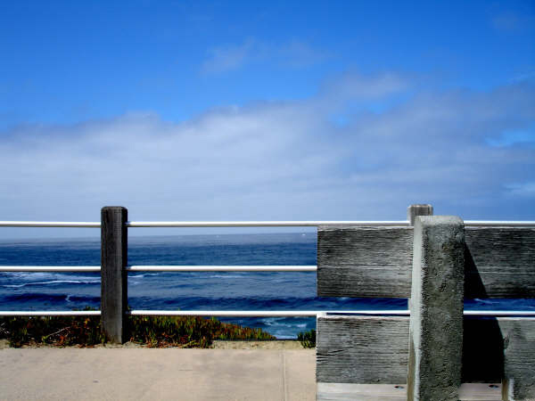
The first thing I will say is to make sure you use the full size allowed. You are really putting your image at a disadvantage when you submit a smaller image.
So that aside, the image is simple and its simplicity can be greatly appreciated (you got an average of 7 from commenters) or not appreciated at all.
As the one commenter indicated it would be nice to see more of the bench. Then again, you appear to have deliberately matched the lines of the back of the bench with the railing so that may have been more difficult had you included more of the bench.
The colors are nice without being oversaturated. Exposure is pretty good except the railing is a bit out of focus due to the large aperture you used. My guess is since you were using such a long lens you were relatively far away. If you were on a tripod you could have gone with around f/11 and got the railing and the bench in focus. (I am guessing though).
Overall, an original take on the challenge and in my opinion well seen. |
|
Comments Made During the Challenge  |
|
|
02/14/2010 10:32:51 PM |
|
|
|
02/14/2010 06:28:41 AM |
| Good lines and pleasing simplicity. |
|
|
|
02/10/2010 04:38:38 PM |
|
|
|
02/08/2010 11:53:43 PM |
| Nice idea but I wanna see the chair being more distinct in the photo. |
|
|
|
02/08/2010 10:28:20 AM |
| The colors on this one are great. I like the parralel lines of the fence and the bench and the horizon of the ocean. |
|
Home -
Challenges -
Community -
League -
Photos -
Cameras -
Lenses -
Learn -
Help -
Terms of Use -
Privacy -
Top ^
DPChallenge, and website content and design, Copyright © 2001-2026 Challenging Technologies, LLC.
All digital photo copyrights belong to the photographers and may not be used without permission.
Current Server Time: 02/01/2026 09:14:01 AM EST.