| Author | Thread |
Comments Made During the Challenge  |
|
|
06/29/2004 03:23:41 PM |
| I want a picture like this for my wedding album! |
|
 Photographer found comment helpful. Photographer found comment helpful. |
|
|
06/26/2004 11:07:05 AM |
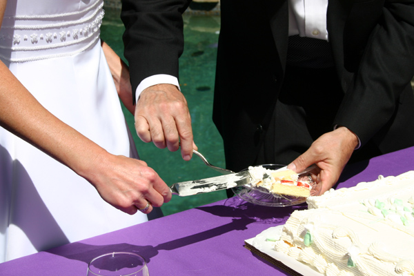
| You have color, focus and nice light. The cake is over exposed and the glass at the bottom is a distraction. It's not bad, just needs a different composition to give it a punch. |
|
| Photographer found comment helpful. |
|
|
06/26/2004 02:11:55 AM |
| Is there a wedding Season? Great shot! |
|
| Photographer found comment helpful. |
|
|
06/26/2004 12:23:11 AM |
| Highlights overexposed..blown out. Good idea. Good job matching title with picture. (They slaughtered that slice of cake.) |
|
| Photographer found comment helpful. |
|
|
06/25/2004 10:00:35 AM |
| the title is good. But picture may be taken more attractive... |
|
| Photographer found comment helpful. |
|
|
06/24/2004 06:51:35 AM |
| mmmmm....cake! Nice shot. I like the perspective. |
|
| Photographer found comment helpful. |
|
|
06/23/2004 02:33:18 PM |
This goes in order of what I notice first:
1) Okay cropping, get rid of the bit of her upper arm that is showing and the glass at the bottom, make the cake piece and their hands central in the frame to bring attetion to them.
2) The cake is blown out and it is distracting.
3) Overall good idea and title, the purple tablecloth adds some nice color, as does the green behind them.
Score: 5 |
|
| Photographer found comment helpful. |
|
|
06/23/2004 01:00:00 PM |
Hmm...this could work as a more formal set-up shot for the Lifestyle section I suppose. So, I'll give you the benefit of the doubt that you actually tried to create a journalistic shot and this isn't just a shot of some friend's wedding.
Photographically, it isn't great. If this was meant to be a candid, their faces should be visible. If it is meant to be a more formal kind of shot depicting one aspect of a traditional wedding, the glass in the foreground should have been removed. It adds nothing to the composition. The harsh midday light is hurting this shot. The whites are extremely blown out. There is virtually no detail to the icing on the cake or in the fabric of her gown. His suit is also lacking detail. What I'm suggesting is, pay attention to those middle values. They are what give a photo depth. Unless you are going for a very abstract high contrast quality (which is rather inappropriate for the subject matter) you need those middle values.
The focus looks a bit too soft to me which doesn't work well with the harsh light and extreme shadows. |
|
| Photographer found comment helpful. |
|
|
06/23/2004 08:56:53 AM |
| This would make a nice shot for a feature story--perhaps not as the lead photo but as part of a series in a photo story. There is lack of contrast in the man's jacket and the whites are overexposed on the cake--tough subjects to capture well in a frame. Can't tell you how to cope with the problem, though, as I often run into it myself. |
|
| Photographer found comment helpful. |
|
|
06/23/2004 04:57:31 AM |
| Whoa, major shadow problem. |
|
| Photographer found comment helpful. |
|
|
06/23/2004 01:34:27 AM |
| Far too cropped for my tastes. (let's see some faces!) Mildly newsworthy (in the right section) Good attempt though. |
|
| Photographer found comment helpful. |
Home -
Challenges -
Community -
League -
Photos -
Cameras -
Lenses -
Learn -
Help -
Terms of Use -
Privacy -
Top ^
DPChallenge, and website content and design, Copyright © 2001-2025 Challenging Technologies, LLC.
All digital photo copyrights belong to the photographers and may not be used without permission.
Current Server Time: 04/07/2025 01:01:31 PM EDT.