| Photograph Information |
Photographer's Comments |
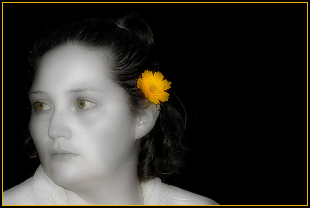
Challenge: Selective Desaturation (Advanced Editing II)
Camera: Nikon D70
Location: Goshen, IN
Date: Jun 19, 2004
Aperture: f/5.6
ISO: 400
Shutter: 1/200
Galleries: Portraiture, Floral
Date Uploaded: Jun 20, 2004
|
Shot of my wife goofing around as we were taking a walk. When I got home, I realized it would work for the challenge. I doubt it will do real well, since it wasn't a setup and perfectly lit shot. I'm also not sure how the soft-focus effect or editing eyes will go over.
Cropped, levels, curves, desaturated all but yellow, did some cloning and healing, color replace on the eyes, USM, applied soft-focus filter, resized, added border.
Hopefully I get over a 5.0. |
| Author | Thread |
Comments Made During the Challenge  |
|
|
06/25/2004 05:11:00 PM |
| Hmm too much dead space on the right. Picture looks a little too soft also. |
|
 Photographer found comment helpful. Photographer found comment helpful. |
|
|
06/25/2004 02:52:18 PM |
| Oops, you aren't supposed to have a portrait picture with the subject looking "out" of the frame. Should have cropped so she is looking INTO the frame. |
|
| Photographer found comment helpful. |
|
|
06/25/2004 03:44:16 AM |
| This is a really nice, simple, well composed shot. Great dof and a very pleasant soft focus to it. The way the flower stands out is perfect. The yellow eys - they look un natural, alien, and totally out of place. Even if they are that color in real life, I woud have greyscaled them with the rest of the face. This picture would have earned a 9 or 10 from everyone easy. |
|
| Photographer found comment helpful. |
|
|
06/24/2004 09:00:28 PM |
| I can only hope the intention was not to make the eyes look yellow also. Unfortunately, that is what I'm seeing and it looks very creepy. The thin yellow border only emphasizes it. The tones in the b&w portion of her skin could be better. There is a very shiny pale area running from her forehead over her left eye and along her nose and down her mouth. It is very distracting. When you convert color to black and white you aren't done. You still need to tone the greys so they aren't so dull looking. An easy way of doing this in PS is to adjust hue/saturation, clicking on the colorize box and then moving the saturation level to very low. You can also adjust the hue level to get the tone you like. I prefer to pretty much leave it in the middle where it is. |
|
| Photographer found comment helpful. |
|
|
06/23/2004 11:59:47 PM |
| I really like the composition and the cropping, but the womans face has a litle too much of a glow / hot spot on the left cheek, |
|
| Photographer found comment helpful. |
|
|
06/23/2004 09:33:37 AM |
| I think the colour in the eyes spoils this picure |
|
| Photographer found comment helpful. |
|
|
06/23/2004 06:07:11 AM |
| For me, your yellow key line in the frame here is a mistake - it amkes the frame part of the picture, rather than something to isolate the picture from its surroundings, precisely because you've used that colour as your choice in the image. The remaining colour in the eyes looks so unreal too - I really do think you should have desaturated those areas also. There's also a pull introduced by your cropping between the face and the flower and the negative space image right - but I don't see a purpose of that negative space here, other than to place the flower on the cntre of image, which I think is weak, compositionally. I like the softness of the image, has a suitability for what feels quite old-time, but I also think you could have found some more definition with your lighting - more depth. All of which sounds hyper-critical, but actually to my eye you're not far off something rather nice here. 6 |
|
| Photographer found comment helpful. |
|
|
06/22/2004 12:15:00 PM |
| This is nice. I like the soft focus and the desaturation works well. The only suggestion is to maybe play with the lighting a little bit since it seems to be a little bit off. |
|
| Photographer found comment helpful. |
|
|
06/21/2004 08:29:58 PM |
| I hope you didn't mean this have a spooky effect. But it certainly stops somebody looking at it to look a second time. |
|
| Photographer found comment helpful. |
|
|
06/21/2004 06:35:21 PM |
| I think this would be much better if you left the eye color desaturated...yellow eyes are a bit spooky |
|
| Photographer found comment helpful. |
|
|
06/21/2004 06:36:36 AM |
| Spooky, not sure I would have left the colour in the eyes |
|
| Photographer found comment helpful. |
|
|
06/21/2004 01:21:11 AM |
|
| Photographer found comment helpful. |
Home -
Challenges -
Community -
League -
Photos -
Cameras -
Lenses -
Learn -
Help -
Terms of Use -
Privacy -
Top ^
DPChallenge, and website content and design, Copyright © 2001-2026 Challenging Technologies, LLC.
All digital photo copyrights belong to the photographers and may not be used without permission.
Current Server Time: 02/01/2026 09:12:07 AM EST.