| Author | Thread |
|
|
02/05/2010 06:50:59 PM |
Greetings from the Critique Club!
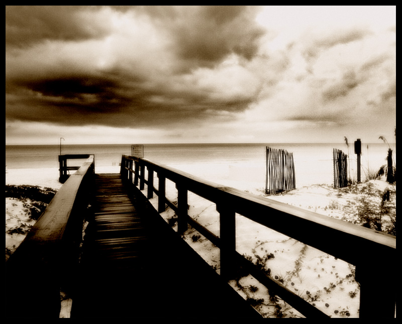
A nicely composed shot, great dof and there is a sense of place here, like the sepia...but to my eye the pp is very heavy-handed. Almost looks like you tried to turn the shot into a charcoal sketch. Interesting to see how the commenters see this shot as either a dark and foreboding scene, or as softly lit and pretty!
For a landscape (OK, seascape) your settings look quite high. F.6, fine...but an ISO of 400 and shutter speed of 250 seem better suited to capturing a squirmy child than a largely stationary scene. A tripod would have been a huge help here, as would have going down to your lowest ISO and going to a much, much slower shutter speed. Yes, that would have resulted in blur from scudding clouds and rollings waves...but the pier would have stayed in sharp contrast to both.
Overall, a decent shot, but you might want to think more about the shot and less about how to improve it in pp.
Feel free to PM me with any questions,
Susan
|
|
Comments Made During the Challenge  |
|
|
01/28/2010 06:40:50 PM |
|
 Photographer found comment helpful. Photographer found comment helpful. |
|
|
01/28/2010 08:07:08 AM |
| Walkway a bit dark but love the grainy processing here. Comp works |
|
| Photographer found comment helpful. |
|
|
01/28/2010 05:06:19 AM |
| Good use of grain. I very much like the processing, and the strong blacks and dark hues of the walkway work very well, leading into the white sands. |
|
| Photographer found comment helpful. |
|
|
01/28/2010 01:45:10 AM |
| I like the composition. am OK only with the edit. I feel that the edit could still make an even better shot, 6 |
|
|
|
01/27/2010 10:50:56 PM |
| Love the toning and contrast. Sorry the vacation was stormy but you got a great picture out of it. |
|
| Photographer found comment helpful. |
|
|
01/27/2010 10:12:50 PM |
| This is some very cool processing. It gives this image such an ominous look. |
|
| Photographer found comment helpful. |
|
|
01/27/2010 02:46:53 PM |
| Looks like a dream scene and the editing goes well with the subject. |
|
| Photographer found comment helpful. |
|
|
01/27/2010 02:02:32 PM |
| a little too over processed for me. but it would have been a great shot without applying too much processing to it. |
|
| Photographer found comment helpful. |
|
|
01/27/2010 10:21:54 AM |
| Very nice. I like the dark mood and atmosphere. |
|
| Photographer found comment helpful. |
|
|
01/26/2010 07:03:34 PM |
| rich in tones and textures, wonderfully processed |
|
| Photographer found comment helpful. |
|
|
01/25/2010 07:36:27 PM |
| Perfect processing for this ominous & forboding scene......7 |
|
| Photographer found comment helpful. |
|
|
01/25/2010 04:45:25 PM |
| I like that processing alot. I like alot of my photos to have that rich, kind of glowy finish too. And the scene is so photogenic and pretty. |
|
| Photographer found comment helpful. |
|
|
01/25/2010 03:29:04 PM |
| love the soft feel and the contrast. |
|
| Photographer found comment helpful. |
|
|
01/25/2010 11:26:45 AM |
|
| Photographer found comment helpful. |
|
|
01/25/2010 09:48:05 AM |
| ? With that border and the incredible contrast and noise, I'm guessing you are going for a brown here? Sorry but this just doesn't work for me, at all. Sorry, but a 3 from me today. (Sorry. ) |
|
| Photographer found comment helpful. |
|
|
01/23/2010 09:52:58 PM |
This looks like an interesting scene, and I'm wondering what exactly you took this with to get this effect, or whether it was just editing.
I'm not sure whether or not I like the framing with the pier running off to the left. It sort of feels like you couldn't make up your mind whether to have it running completely off to the left or in centre so just chose middle ground. |
|
| Photographer found comment helpful. |
|
|
01/23/2010 11:15:46 AM |
| Sepia is working well here. I think you made a pretty shot. |
|
| Photographer found comment helpful. |
|
|
01/22/2010 11:48:38 PM |
| I like the soft warmth of this. |
|
| Photographer found comment helpful. |
|
|
01/22/2010 09:55:17 PM |
| you have such a nice picture here...but I'm not sure what you did HDR or just to much Dodge & Burn...I like the composition alot but the overly deep tones takes away from the picture for me...what a nice location |
|
| Photographer found comment helpful. |
|
|
01/22/2010 05:30:08 PM |
| Good composition but too contrasty for my tastes. A lot of grain in the sky, looks like it was added in processing, not sure why. Horizon is also tilted to the left. |
|
| Photographer found comment helpful. |
|
|
01/22/2010 01:01:43 PM |
| Nice composition; need to get the horizon line leveled though. |
|
| Photographer found comment helpful. |
|
|
01/22/2010 04:49:55 AM |
| a little dark but has a mood to it |
|
| Photographer found comment helpful. |
Home -
Challenges -
Community -
League -
Photos -
Cameras -
Lenses -
Learn -
Help -
Terms of Use -
Privacy -
Top ^
DPChallenge, and website content and design, Copyright © 2001-2026 Challenging Technologies, LLC.
All digital photo copyrights belong to the photographers and may not be used without permission.
Current Server Time: 02/01/2026 09:46:39 AM EST.