| Author | Thread |
|
|
05/16/2005 12:55:42 PM |
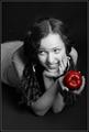
| I love this! Interestingly, I desaturated some of the photos I took at the chalk drawing except for the art like you did on this one!! I haven't posted them anywhere yet. Great minds think alike :) |
|
 Photographer found comment helpful. Photographer found comment helpful. |
|
|
06/28/2004 03:26:04 AM |
Hey - check you out! I really loved this picture and should have commented on it during the challenge, but I was busy showing a lovely family around Tokyo. ;-) Congrats!
Message edited by author 2004-06-28 05:24:18. |
|
| Photographer found comment helpful. |
Comments Made During the Challenge  |
|
|
06/27/2004 07:01:16 AM |
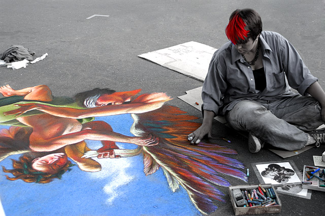
| Very very good.....Pleasantville-like idea of colouring the world. I'm afraid the hair colourisation detractsfor me....takes away the simple beauty/consistancy of the concept |
|
| Photographer found comment helpful. |
|
|
06/27/2004 01:46:56 AM |
| Wow, I love it! it's original & the color job is very well done! |
|
| Photographer found comment helpful. |
|
|
06/25/2004 02:50:03 PM |
| Pretty good. Should have cloned out the cloth on the left and the "v" shaped thing at the top. I'd have played with the B&W levels a little to more contrast, darker road, etc. |
|
| Photographer found comment helpful. |
|
|
06/24/2004 10:33:01 PM |
| Personally, I'd have desaturated the hair as well. The colour may be interesting, but it draws attention away from the artwork. |
|
| Photographer found comment helpful. |
|
|
06/24/2004 12:18:17 PM |
| I think this is a brilliant idea and it's been nicely done. I like the red highlights in her hair, but I am seeing some blue around that part. This little bit of blue is bothering me a bit. Otherwise I think it's a very good image. |
|
| Photographer found comment helpful. |
|
|
06/23/2004 05:57:37 PM |
| AWESOME. I LOVE IT!!!!!!!!!! 10 |
|
| Photographer found comment helpful. |
|
|
06/23/2004 04:16:06 PM |
| Great subject and composition. Your selected areas of desaturation really emphasize the feelings in this photo. The juxtaposition of the "artist" against the cold urban backdrop is nice..... 7 |
|
| Photographer found comment helpful. |
|
|
06/23/2004 12:43:20 PM |
| thr red hair draws attention away a little bit, but i still love it ... great shot |
|
| Photographer found comment helpful. |
|
|
06/22/2004 09:01:26 PM |
What beautiful artwork on the sidewalk. Ah, to be so talented.
I like the composition of this shot but for my taste, too much was left in color. Maybe if you had just left the artwork in color and desaturated everything else it would make a bigger impact to me. The oils being colorless yet so much color, but from where? See what I'm talking about? Just a thought. This is a lovely shot and I hope you got the artists name so you could offer them a print of it. As is a 6 |
|
| Photographer found comment helpful. |
|
|
06/22/2004 05:24:54 PM |
| this is a very clever use of desat - though i wonder why you elected to to keep her hair with the red highlights and the slightly blue pastelly shirt coloured. i think it might have conveyed more of an impact if all but the artwork was B&W. i love the idea though, and technically the shot passes muster too - focus and composition is top dog! though, being unfairly picky, the patch of white in the extreme lower left corner is a bit distracting. that aside, well done. 8. |
|
| Photographer found comment helpful. |
|
|
06/22/2004 12:50:03 PM |
| What an original idea. I love it! Great colors and I love that you kept some of the chalk in the boxes color, very nice detail as well as the red in her hair. Nice take on the challenge. |
|
| Photographer found comment helpful. |
|
|
06/22/2004 07:46:19 AM |
| Fantastic use of color. I really like that you desaturated multiple items and kept the photo interesting. Bravo. |
|
| Photographer found comment helpful. |
|
|
06/21/2004 09:47:54 PM |
| Very nice! My favourite so far! 10 |
|
| Photographer found comment helpful. |
|
|
06/21/2004 06:05:54 PM |
| Really great colors and composition, gets a 10 for its originality. Good luck... |
|
| Photographer found comment helpful. |
|
|
06/21/2004 02:25:54 PM |
| Beautiful! Was his hair really that color? 9 |
|
| Photographer found comment helpful. |
|
|
06/21/2004 01:42:56 PM |
| This is just a beautiful picture. I love the colors. The only little nitpick is the red in the hair, which appears on my monitor to be a bit oversaturated, but it doesn't detract that much. Great image. |
|
| Photographer found comment helpful. |
|
|
06/21/2004 10:29:58 AM |
|
| Photographer found comment helpful. |
|
|
06/21/2004 07:12:21 AM |
| Great job with the photo. |
|
| Photographer found comment helpful. |
|
|
06/21/2004 02:39:38 AM |
| A poor choice of a picture to use in this challenge. There is no single object or set of object to highlight ....... and what you have in color, there is waaaaay too much of. If you had desat the whole pic and just left that hair red, that would have worked. |
|
|
|
06/21/2004 02:36:44 AM |
| Pretty good, would've liked the shot to have less colors however, maybe just the artwork, for example. |
|
| Photographer found comment helpful. |
Home -
Challenges -
Community -
League -
Photos -
Cameras -
Lenses -
Learn -
Help -
Terms of Use -
Privacy -
Top ^
DPChallenge, and website content and design, Copyright © 2001-2026 Challenging Technologies, LLC.
All digital photo copyrights belong to the photographers and may not be used without permission.
Current Server Time: 02/01/2026 09:03:34 AM EST.