| Author | Thread |
Comments Made During the Challenge  |
|
|
06/27/2004 06:36:20 AM |
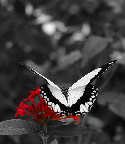
| Awesome contrast. The crop could be improved- the negative space on the top is too much. |
|
 Photographer found comment helpful. Photographer found comment helpful. |
|
|
06/26/2004 06:36:23 PM |
| First impression: The butterfly should have been in color. Second impression: desaturating the butterfly makes this a spectacular picture, with both selective desaturation and selective DOF giving it tremendous depth. A definite 10. |
|
| Photographer found comment helpful. |
|
|
06/26/2004 01:25:43 AM |
| nice, but i'd have liked to see the butterfly in colour to, Or maybe he aint to colourful? |
|
| Photographer found comment helpful. |
|
|
06/25/2004 12:56:14 PM |
| Nice photo. Brightness is a little on the dark side though. |
|
| Photographer found comment helpful. |
|
|
06/25/2004 03:38:48 AM |
| I think I would have prefered to see the butterlay in colour, nice image though |
|
| Photographer found comment helpful. |
|
|
06/25/2004 01:48:05 AM |
| even with the color left in the flowers, me attention is drawn to the butterfly. great contrast. I would like to see a full b&w version |
|
| Photographer found comment helpful. |
|
|
06/23/2004 11:53:03 PM |
| I've seen several butterflies in this challenge where everything but the butterfly was desaturated. What is it they are trying to say? Here, you've left the flower with a title of "Attraction." GREAT!!! The title emphasizes the point of the photo. I could see this as a poster with the title printed across the top of the photo in that negative space (I know this is illegal for the challenge -- I'm just making a suggestion for a future print). Great DOF and nicely cropped. Maybe not a winner, but should make top 10 IMHO. |
|
| Photographer found comment helpful. |
|
|
06/23/2004 08:11:02 PM |
| very nice. I like the angle of the butterfly in the shot. framing/ cropping is nice also. The butterfly looks real sharp. There looks to be a few hard lines aroud the red flowers that the selection tool missed. Im sure it wil make a very nice print |
|
| Photographer found comment helpful. |
|
|
06/23/2004 04:11:14 PM |
| Beautiful photo with the butterfly in sharp focus (at least the top half). Interesting to choose the flowers to be colorized, I would've chosen the butterfly but that's what makes this photo different. Selection of the flowers under the butterfly seems a bit "loose" as parts of the background were left out when desaturating. |
|
| Photographer found comment helpful. |
|
|
06/23/2004 03:28:58 PM |
| nice black and white. many of the shots seem to have overlooked the b&w when concentrating on the color. |
|
| Photographer found comment helpful. |
|
|
06/23/2004 04:58:23 AM |
| I think I would have left the butterfly coloured, It could have created better balance for the shot. This full colour photo must look quite nice. Back end of butter fly is slightly out of focus. Good effort. |
|
| Photographer found comment helpful. |
|
|
06/23/2004 02:39:21 AM |
| Interesting that you chose to color the flowers instead of the butterfly. Good job |
|
| Photographer found comment helpful. |
|
|
06/23/2004 01:42:07 AM |
I think I would have preferred to have the butterfly in color and the rest of the photo in black and white. I don't think it quite works the way you have it.
|
|
| Photographer found comment helpful. |
|
|
06/22/2004 09:58:42 PM |
| This could have been a 10 if you had colored the butterfly - it's certainly the main subject with perfect symetry and freshly sprouted! Nearly the perfect picture to use for this challenge............... nice focus, good dof and excellent contrast. Excellent workmanship on separating the color from the background. Perhaps others will appreciate the flower over the butterfly. It's a great picture in any case. Good work. Rated 7. |
|
| Photographer found comment helpful. |
|
|
06/22/2004 08:25:50 AM |
| Nice image. I think it would look better with some cropping at the top. |
|
| Photographer found comment helpful. |
|
|
06/22/2004 08:03:22 AM |
| I'd like to see this with the butterfly being in color and everything else grayscale. It's ok as is, but that butterfly is so bright in white, I have to wonder what it looks like in color. Also, since it is in the foreground and the focal point, I think leaving it the only thing in color would really increase the impact of the shot. Great composition and I love the depth of field. |
|
| Photographer found comment helpful. |
|
|
06/21/2004 04:48:51 PM |
| What a wonderful choice you made. First of all, it's a beautiful, crisp & clean photograph. Without the saturation work it would have been wonderful, I'm sure but what you did here is really excellent. The butterfly is beautiful and so is the red flower. Nice work. |
|
| Photographer found comment helpful. |
|
|
06/21/2004 04:44:09 PM |
|
| Photographer found comment helpful. |
|
|
06/21/2004 02:44:14 AM |
|
| Photographer found comment helpful. |
|
|
06/20/2004 11:27:45 PM |
| This one tells the story better than most, nice contrast, 9 |
|
| Photographer found comment helpful. |
|
|
06/20/2004 11:26:15 PM |
| Very interesting choice of where to desaturate, not the obvious leave the butterfly in colour. It really works well! |
|
| Photographer found comment helpful. |
Home -
Challenges -
Community -
League -
Photos -
Cameras -
Lenses -
Learn -
Help -
Terms of Use -
Privacy -
Top ^
DPChallenge, and website content and design, Copyright © 2001-2025 Challenging Technologies, LLC.
All digital photo copyrights belong to the photographers and may not be used without permission.
Current Server Time: 04/07/2025 12:15:58 AM EDT.