| Author | Thread |
|
|
07/01/2004 01:29:53 PM |
thanks a lot awpollard. For your compliment, but also for your very elaborate tips on the border. I am just starting out fiddeling with borders and I find your remarks both very insightfull and helpfull. I will definitely use them in the future.
|
|
|
|
07/01/2004 09:57:06 AM |
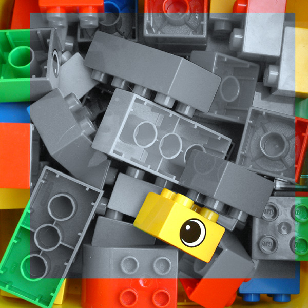
Greetings from the Critique Club:
This is a nicely done, original and creative piece. It is a fun, yet intriguing picture to look at.
The choice to use a border for this shot was good one. In this case where there is no really no definable edge in the shot, without a border the desaturated area would run off the edges causing the shot to look flat.
The off center border is a very nice touch; there is a lot of geometry, hard edges, dimension and organized elements in this shot. IMO, by not having a centered border you make the viewer rethink the whole organization aspect. You have broken up the organization where every square that must be in a certain space isn�t. You've shown some freedom in a very methodical shot. Throw the viewer off a bit, I like that.
I like the use of the colorized pieces in the border as opposed to a solid border. A solid border would have given this a harsh mechanical feel. However the border as it is, is very busy with a lot of detail of it's own that draws the viewer outward away from the subject.
My suggestion in this case (advanced editing challenge), would be to mask the current border, then apply just enough Gaussian Blur to the border to take any interest away from it. Apply blur to the point where you can just make out the edges of the circles and lines of the tiles in the border but don�t go so far as to create a hard line between the border and gray area. This keeps the colorful warm feeling against the gray background but does not lure the eye outward. If you was to desaturate the border somewhere between the yellow tile and gray area, it would retain the detail and not effectivly push us inward.
The eye/brain combo really likes to take the easy way out most of the time. With an Out of focus border surrounding a desaturated background the viewer is going to immediately be attracted to the in focus brightly colored tile no matter where it is in the shot.
A slight softening of the desaturated area by decreasing the contrast would help to take some of the hard dark edges off of the desaturated tiles and further push the viewer to the Yellow tile.
This is very creative, well designed shot. Keep up the good work.
Andy
|
|
 Photographer found comment helpful. Photographer found comment helpful. |
|
|
06/28/2004 07:29:02 AM |
| Thanks all for the comments. I knew from the moment the voting started that I would score low, but the comments really made up for that. It's satisfying to know that there ARE some people who appreciate what I tried to do here. |
|
|
|
06/28/2004 06:55:17 AM |
| i feel slightly cheated on your behalf here - no WAY did you deserve 13 ones and twos... the average 6.75 from commentors just goes to prove that you really need a bit of a moment to appreciate this, which obviously the speed voters didn't get. i thought this was a lovely composition, a nice modern bit of artiness and deserved to do far better. |
|
| Photographer found comment helpful. |
Comments Made During the Challenge  |
|
|
06/27/2004 07:14:21 PM |
| This one caught my attention. Artsy and very different from the rest. Made me look longer imagining the colors extend to the grey areas. |
|
| Photographer found comment helpful. |
|
|
06/27/2004 06:22:22 PM |
| It's a fun photo. I don't know if the colorized border helps or hinders. The grayed blocks could probably be a little more contrasting in shades. |
|
| Photographer found comment helpful. |
|
|
06/26/2004 04:52:56 PM |
| Different and playful use of desaturation. Good job! |
|
| Photographer found comment helpful. |
|
|
06/25/2004 07:56:44 PM |
| Interesting concept using the outter part as a frame. It does detract from the yellow brick in the center, but, adds an overall balance to the shot. Pretty neat 'out of the box' idea - and the only one in this challenge like it - you are original. (ummmm you did give the blocks back to the kids, right?) |
|
| Photographer found comment helpful. |
|
|
06/25/2004 01:27:17 PM |
| There's a bit of noise in your photo. |
|
| Photographer found comment helpful. |
|
|
06/25/2004 04:25:57 AM |
|
| Photographer found comment helpful. |
|
|
06/25/2004 04:00:01 AM |
| I like your approach, although I wish the frame area was central - well done |
|
| Photographer found comment helpful. |
|
|
06/24/2004 07:48:00 PM |
|
|
|
06/23/2004 11:30:09 PM |
Just my humble opinion, but this looks gimmicky to me. Kind of hokey. I like the b/w part. You have nice tonal range there. The yellow eye brick works too! You lose me with the off centered, left in color border.
TC |
|
| Photographer found comment helpful. |
|
|
06/23/2004 08:15:33 PM |
| my firt reaction was WTF, but after looking at it I can see this is a much different approach than what most would have done. GREAT IDEA !!! A few of the blocks look like they have some not so finished lines around them. |
|
| Photographer found comment helpful. |
|
|
06/23/2004 05:02:05 AM |
| no doubt 90% of comments you'll receive will be about the border - and the other ten percent will be about how 90% will be about the border. but still - that border! it's a very original, and strikingly effective way of fitting in the challenge. to be honest, it's so strikingly effective the yellow brick is a little unecessary in the scheme of things. my only other slight criticism is that the top part of the frame is a bit uneven. that aside, i found this quite bold and most enjoyable to view. 8. |
|
| Photographer found comment helpful. |
|
|
06/22/2004 09:28:39 AM |
It took me a while before I commented on this photo.
I think it's done nicely, a simple approach with nice outcome.
Very different. Stands out from the rest! |
|
| Photographer found comment helpful. |
|
|
06/22/2004 08:59:55 AM |
| Great idea, nicely done. I would have placed the "inner color frame" differently though, either right in the middle or more off than it is. It kinda looks like it (the desaturation frame) was thown onto the picture. Original. |
|
| Photographer found comment helpful. |
|
|
06/22/2004 01:16:33 AM |
| Very creative border! And a very effective image. 9 |
|
| Photographer found comment helpful. |
|
|
06/21/2004 04:18:22 PM |
| This is very interesting and I like it. Unusual idea for the challenge. |
|
| Photographer found comment helpful. |
|
|
06/21/2004 03:32:14 PM |
| i dont think the 'zone' of desat bordered by color works especially well. esp because it's asymmetrical. |
|
| Photographer found comment helpful. |
|
|
06/21/2004 12:17:20 PM |
| Very artistic and creative! Like it a lot. |
|
| Photographer found comment helpful. |
|
|
06/21/2004 10:14:10 AM |
Clever idea. I would like to see the desaturated area reduced to about 50%
of the picture area. |
|
| Photographer found comment helpful. |
|
|
06/21/2004 06:19:37 AM |
| Very creative application |
|
| Photographer found comment helpful. |
|
|
06/21/2004 04:03:08 AM |
| Interesting choice. Is someone afraid of yellow bricks? |
|
| Photographer found comment helpful. |
|
|
06/20/2004 09:58:37 PM |
| The border detracts from the selective desaturation. Without the border this would've been an 8 or 9, as is, only a 5. The point was to highlight something bringing attention to the colored area(s). |
|
| Photographer found comment helpful. |
Home -
Challenges -
Community -
League -
Photos -
Cameras -
Lenses -
Learn -
Help -
Terms of Use -
Privacy -
Top ^
DPChallenge, and website content and design, Copyright © 2001-2025 Challenging Technologies, LLC.
All digital photo copyrights belong to the photographers and may not be used without permission.
Current Server Time: 04/07/2025 12:14:40 AM EDT.