| Author | Thread |
Comments Made During the Challenge  |
|
|
01/07/2010 10:02:48 PM |
| well, these could work in the Things that no longer work challenge...really like the old feel of this |
|
 Photographer found comment helpful. Photographer found comment helpful. |
|
|
01/04/2010 05:28:56 PM |
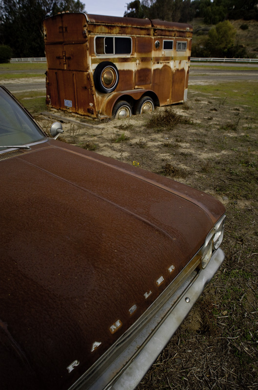
| I like the texture on the Rambler's hood. It's also nice that all of the tones are rather drab... lends to the "End of an Era" idea. What might have really added to this is if you waited for a new car to drive by in the background, especially if your shutter was longer and there was motion blur on the newer car. I would have liked that quite a bit, continuing the theme by showing the viewer these static objects being left behind by the future. |
|
| Photographer found comment helpful. |
|
|
01/02/2010 09:51:19 PM |
| With this much rust I would have loved to see the processing pushed a bit to really bring it all out. This here appears to be a snapshot, yet it was not balanced or composed very well. The detachment of the hood of the car in the foreground is misplaced and does not make any sense to me when it appears the trailer is the subject. For me, I would have enjoyed a nice strong low angle shot of the car in all its rust and glory or even something more dramatic with the trailer alone. But as the two, it just does not do it for me. |
|
| Photographer found comment helpful. |
|
|
01/01/2010 03:32:19 AM |
OK, I'm going through the Free Study submissions, purposefully finding those images I think are shot with a less conventional eye - this is one of those images! Thanks for offering something that isn't just DPC friendly eye-candy (though of course there's nothing wrong with eye-candy). I'll be picking one of these images for the Mu (most underrated) award:
Positives: This image offers the viewer something they wouldn't see every day - I like that. I also like the perspective your POV has offered, it has a geometric quality that leads the eye in a zig-zag pattern. The RAMBLER text and the sunken wheels of the trailer are the highlights of the image for me.
Critical stuff: The aspect ratio of the image is an interesting - I must say that I feel a little constrained while viewing it. The zig-zag my eyes take happens quite rapidly and the limited lateral real estate in the composition makes viewing feel a little like playing pinball! The coloration and the tone mapping is a little overpowering but I am sure this is intentional. If I were to pick a real hole in the image it would relate to the lighting which is a little flat to add much drama to the scene.
Overall: I think this image delivers what you set out to achieve - it is grungy, gritty and stark. However, I think the flat lighting makes this scene a little less effective as an image than it might have been. |
|
| Photographer found comment helpful. |
Home -
Challenges -
Community -
League -
Photos -
Cameras -
Lenses -
Learn -
Help -
Terms of Use -
Privacy -
Top ^
DPChallenge, and website content and design, Copyright © 2001-2026 Challenging Technologies, LLC.
All digital photo copyrights belong to the photographers and may not be used without permission.
Current Server Time: 02/01/2026 09:16:37 AM EST.