| Author | Thread |
Comments Made During the Challenge  |
|
|
06/25/2004 03:38:31 PM |
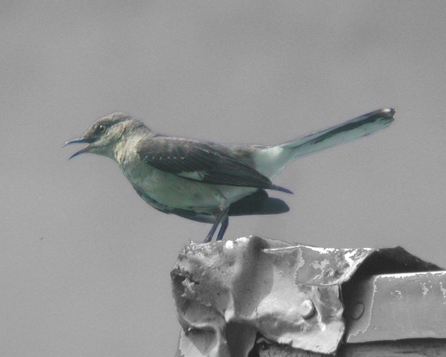
| Somehow the colors just don't appear natural looking..... as if something is reflecting onto the bird. It deffinitly stands out. |
|
 Photographer found comment helpful. Photographer found comment helpful. |
|
|
06/24/2004 06:47:09 AM |
| The desaturation didn't really make the bird standout that much. |
|
| Photographer found comment helpful. |
|
|
06/23/2004 08:07:33 PM |
| i feel the outline of the bird has too much of a hard line where you used the selection tool. Maybe try a softer edge next time to reduce the effect of the selection tool. not sure which program you used, but there should be an option for "soft edge" |
|
| Photographer found comment helpful. |
|
|
06/22/2004 02:25:00 PM |
| Bird looks a bit out of focus, and colors are very soft, maybe if you made the colors harder this photo would be better... |
|
| Photographer found comment helpful. |
|
|
06/21/2004 03:28:17 PM |
| excellent closeup of a bird, but not the most well-rendered example of selective desat., i think the colors are not well suited - the bird doesn't look too different from black and white |
|
| Photographer found comment helpful. |
|
|
06/21/2004 03:09:56 PM |
| the bird looks a lot like a painting (not a good or bad thing, just an observation). if i were to recommend one thing, it would be to boost the contrast a little. |
|
| Photographer found comment helpful. |
|
|
06/21/2004 03:41:20 AM |
| looks like a cardboard cut-out |
|
| Photographer found comment helpful. |
|
|
06/20/2004 09:40:45 PM |
|
| Photographer found comment helpful. |
Home -
Challenges -
Community -
League -
Photos -
Cameras -
Lenses -
Learn -
Help -
Terms of Use -
Privacy -
Top ^
DPChallenge, and website content and design, Copyright © 2001-2025 Challenging Technologies, LLC.
All digital photo copyrights belong to the photographers and may not be used without permission.
Current Server Time: 04/07/2025 05:57:18 AM EDT.