Greetings from the Critque Club!
Composition:
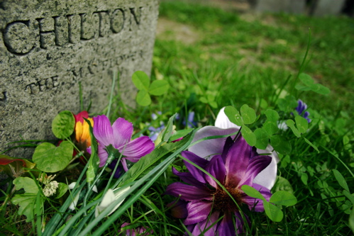
Your chosen cropping, angle, and subject matter are very nice. No real complaints there. As many people stated, however, the choice is not obvious. Your title is Mayflower Death, I can see the begginning of the word Mayflower on the tombstone, but can't see the significance. Someone commented that perhaps the choice is between artificial and real flowers. Which would work, but isn't exactly something most people fret over for weeks on end, if you get my drift.
Lighting:
Your lighting is great. It brings out the colors nicely, good contrast, and very pleasing to the eye. Even the grey of the tombstone looks good.
Technical:
You chose a very short depth of field, while it's proper depth for the flowers, if that was the subject for the 'choice' then it's fine as it is. If your subject was more to do with the Mayflower, than your depth of field is too short, getting the whole word of "Mayflower" in focus is rather important. Again I have no idea what your subject was supposed to be for the "choice".
Post-processing:
You listed no editing steps, and the photo looks good as it is, so not sure if you did any and they are natural enough to not be seen, or if you took this straight out of the camera with a minor crop. Your photo is about 150 pixels short of the limit of 640, and the size of the file is only 109KB, about 40 short of the size limit. Getting the full size of one or the other (preferably both) will help your photo convey it's message easier. It will look better, and you'll have more room to work with in your cropping.
Overall:
The choice is very hidden, perhaps you can tell us what you were going for. The photo itself looks very nice, but without seeing an obvious choice, suffered greatly in the scoring. Your lighting is superb, as well as the contrast. You might want to choose a more obvious subject in future challenges, or make sure the photo really conveys what you have in your head.
Nice attempt, I look forward to future submissions! |