| Author | Thread |
|
|
06/23/2004 12:03:39 PM |
Greetings from the Critique Club
(Oh, great, one of Konador's shots! lol)
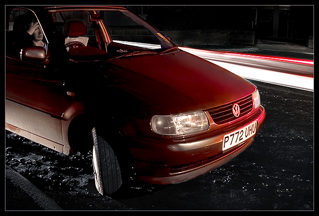
Composition: emorgan49 goes through the leading lines well. I also think the lit spots gravel/road is a bit annoying, but they do give a nice texture. Maybe it would be better in the point of interest (the dude) were closer to the road, but that would also mean he wouldn't be in the driver's seat. This is minor, but it would be cool in the wheel on the bottom were pointing at him. I don't know if you tried this, but maybe him standing outside the car, like sitting on the hood looking at the map. Then you would have to show less of the car, and composition may have improved. Then of course getting him that steady for 30 seconds.
Technical: I don't get why the left side of the car is lit up, wouldn't it be dark? Skin tones seem a bit unnatural, but the lighting from car headlights/tail lights is unnatural. I don't really like the pink reflection either; it would probably stand out a bit more if the car was a dif. color. I do like the streaks in the background, give a nice sense of time to the image.
Meets the Challenge: Check.
Overall: I like that the image tells a story, but I think it could have been set up better. |
|
 Photographer found comment helpful. Photographer found comment helpful. |
|
|
06/22/2004 09:48:09 AM |
It doesn't come together as a whole/ the interesting parts are over shadowed by the distracting parts. The gravel under the car is a major distraction. All those little light spots - maybe clone out each and every one. The wheel is at an odd angle and has an odd glare The car is an unattractive shade of orangy red (don't laugh, it matters to the voters) and it clashed with the brighter pinky red of the tail light streams. The person is too far off to the right to be noticed right way, remember those leading lines? they all lead to him but by the time the veiwer gets to him, the eyes have built up too much momentum heading out of the picture (mind says "all done, next) The subject guy isn't strong enough to being me back into the scene. He looks odd in sepia, maybe he should be black and white? He appears to be ill, or have a headache. The map really isn't noticieble, I didn't see it till I read the caption, it looks like part of the passenger seat.
So what is interesting? The passing cars are. The guy is and his story, lost map etc. the red car, the night. They are just out of balance. The red car dominates the image yet contributes the least to the story. The guys is lost in left field. the passing cars are weighted down by the heavy gravel foreground.
Is that enough? Oh yeah, and the steering wheel is on the wrong side so a large percentage of your viewers will not identify him as the driver but the passenger and wonder where the driver went, and whats the rest of the story. |
|
| Photographer found comment helpful. |
Comments Made During the Challenge  |
|
|
06/20/2004 08:44:47 AM |
I know the feeling. A great shot, nice lighting. Took a lot time in setting up.
Really good effort. |
|
| Photographer found comment helpful. |
|
|
06/20/2004 01:39:00 AM |
| Interesting shot, I like the POV and angle, also the motion blured lights. I could see this being on a tow truck ad or something... good job. |
|
| Photographer found comment helpful. |
|
|
06/17/2004 01:00:08 AM |
I really like this shot, the person behind the seat actually looks a little like they are computer generated, something out of a comic strip animation? (No offence meant...)
The lighting here is great, the long exposure at the side is brilliant. Well done! |
|
| Photographer found comment helpful. |
|
|
06/15/2004 11:21:09 AM |
| Very nice. The lighting is near perfect. |
|
| Photographer found comment helpful. |
|
|
06/15/2004 03:39:20 AM |
| this one has a creepy feel, great color work, (would be excellent if the car was a bit more unusual or interesting - no insult to your car meant!) light from behind and the streaking cars going by makes the shot. One of my favorites this challenge |
|
| Photographer found comment helpful. |
Home -
Challenges -
Community -
League -
Photos -
Cameras -
Lenses -
Learn -
Help -
Terms of Use -
Privacy -
Top ^
DPChallenge, and website content and design, Copyright © 2001-2025 Challenging Technologies, LLC.
All digital photo copyrights belong to the photographers and may not be used without permission.
Current Server Time: 04/07/2025 12:54:10 PM EDT.