| Author | Thread |
|
|
08/20/2004 01:35:35 PM |
Originally posted by Tucci:
Just a friendly suggestion...forget about the hue/saturation....use LEVELS to really get control over your contrast. Try making a LEVELS adjustment layer. Also to easliy and precisely correct color in your images you need to use the CURVES dialog. Set your RGB values to 10, 133 and 245 respectively (black, grey and white) then use the eye dropper and sample those colors in your image and the color will correct itself. Finally use the UNSHARP MASK with your image at full size... set pixels to 1.5, threshold to 4 levels and anywhere from 80 to 130 percent should do the trick and add some clarity to your shots. |
Thanks for the very good advice. I actually started using the Levels recently after stumbling across some advice in a book. I hardly ever use the brightness/contrast adjustments and now I only use Levels to achieve satisfactory black and white images.
I will try the other things you suggested in the future. I've never used unsharp mask because, frankly, I haven't a clue how. :-D One of these days I'll get me a good PS book!
For now I have some guidelines which I'm going to copy and past for my files. Thanks a bunch! |
|
|
|
08/20/2004 01:19:43 AM |
| Just a friendly suggestion...forget about the hue/saturation....use LEVELS to really get control over your contrast. Try making a LEVELS adjustment layer. Also to easliy and precisely correct color in your images you need to use the CURVES dialog. Set your RGB values to 10, 133 and 245 respectively (black, grey and white) then use the eye dropper and sample those colors in your image and the color will correct itself. Finally use the UNSHARP MASK with your image at full size... set pixels to 1.5, threshold to 4 levels and anywhere from 80 to 130 percent should do the trick and add some clarity to your shots. |
|
 Photographer found comment helpful. Photographer found comment helpful. |
|
|
06/24/2004 04:41:03 AM |
| Hmm. It does kinda look like boba fett. Love how the color of this one turned out. |
|
| Photographer found comment helpful. |
Comments Made During the Challenge  |
|
|
06/18/2004 02:35:48 PM |
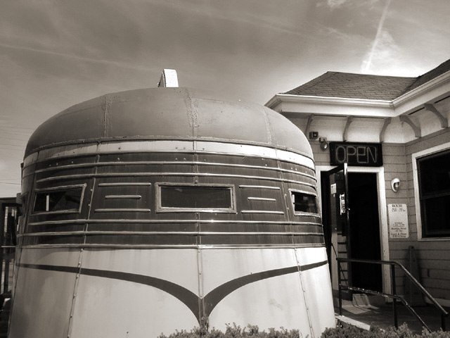
| It looks to me like this might be a train car, but the composition doesn't work well imho. My eyes are drawn to the building with the "open" sign, but that is clearly not the selling point of this image. I think a different angle on the diner (to the left, showing about the same amount of train car (if thats what it in fact is) and less of the building structure might work. |
|
| Photographer found comment helpful. |
|
|
06/14/2004 09:50:16 PM |
| interesting image very unusual and good detail but I dont see a train car or plane |
|
|
|
06/14/2004 05:23:35 AM |
| Interesting shot, lighting is a little harsh, but nice contrast. Good job. |
|
| Photographer found comment helpful. |
|
|
06/14/2004 01:22:13 AM |
|
|
|
06/14/2004 01:18:16 AM |
| Great capture, and the black and white choice was a must for this shot. Outstanding. |
|
| Photographer found comment helpful. |
Home -
Challenges -
Community -
League -
Photos -
Cameras -
Lenses -
Learn -
Help -
Terms of Use -
Privacy -
Top ^
DPChallenge, and website content and design, Copyright © 2001-2026 Challenging Technologies, LLC.
All digital photo copyrights belong to the photographers and may not be used without permission.
Current Server Time: 02/01/2026 10:28:12 AM EST.