| Author | Thread |
|
|
06/28/2004 11:25:29 PM |
Greetings from the Critque Club!
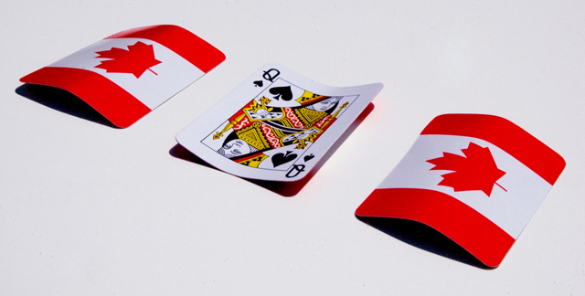
Composition:
Very nice. You defined "less is more". Not only that but it's also perfect for the "rule of 1/3rds". The bright reds contrast nicely with the background, as well as differing from the flipped card.
Lighting:
I like this light. While it's extremely bright. It's not overly bright. There aren't any areas of white blown out. (No "blinkies" on the LCD, areas of no discernable data) The shadows are rich and deep. Zero complaints on the lighting.
Technical:
f/25 seems like overkill, but it'll insure the entire photo is focused. Which yours is. The photo is also properly exposed, providing maximum color / contrast.
Post-Production:
You didn't list any steps you took on the photo. But what I can say is that when you resized the photo it suffered from soft focus. Using the unsharp mask filter after resizing will keep the sharp focus that the original has at f/25 ;) I'm going to guess you tweaked the contrast and or levels etc, if so you did a great job. If not, your photography skills are even better. :)
Overall:
Great idea, great implementation. Superb lighting, contrast etc. Only recommendation is a little sharpening after resizing. Excellent work. |
|
Comments Made During the Challenge  |
|
|
06/20/2004 11:11:35 AM |
| Nice... simplicity can be good. |
|
|
|
06/19/2004 01:50:59 AM |
| Great Idea. I love the photo. I love the shadow from the cards. Love the colors. Love the entire composition. One of the best. Beats the hell out of mine. Good luck! 10 |
|
|
|
06/19/2004 01:19:32 AM |
|
|
|
06/17/2004 01:22:19 PM |
| Looks like the choice has been made here. I would have left all three cards turned over. Very patriotic by the way. Good lighting. If you do turn over a card - a red card (perhaps ace of hearts), would have given this more of a leading line across the shot (with red diagnal being perceived as the line). Great concept though. |
|
|
|
06/17/2004 09:32:31 AM |
|
|
|
06/17/2004 12:49:56 AM |
| I love the lighting you have here. The contrast between the background and the shadows is excellent. Well done. |
|
|
|
06/16/2004 05:45:16 PM |
|
|
|
06/16/2004 11:39:00 AM |
|
|
|
06/16/2004 03:57:27 AM |
| So, You're from Germany then? Japan? Go on, I can guess.... The lighting is quite harsh, but works for this, but your focus seems a little soft on the middle card. |
|
|
|
06/16/2004 01:48:26 AM |
| I don't know that game. I won't take away points for it though, and I hope others don't either. However, in the future maybe stick to more commenly known games. 7 |
|
Home -
Challenges -
Community -
League -
Photos -
Cameras -
Lenses -
Learn -
Help -
Terms of Use -
Privacy -
Top ^
DPChallenge, and website content and design, Copyright © 2001-2026 Challenging Technologies, LLC.
All digital photo copyrights belong to the photographers and may not be used without permission.
Current Server Time: 02/01/2026 10:28:16 AM EST.