| Author | Thread |
|
|
11/06/2009 09:45:19 PM |
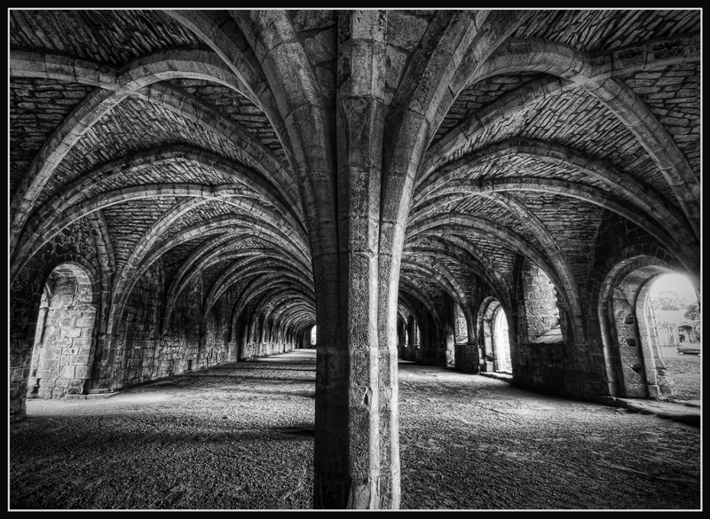
| I do concentrate on the structure a bit more in the B&W version. I find that I don't "wander" out to the far right opening in this version. Still, both versions are nice. |
|
 Photographer found comment helpful. Photographer found comment helpful. |
|
|
11/06/2009 11:36:29 AM |
| B/W for me. In the color version the middle section seems to be more prominent of a focal point. Here my eyes wanders around more, and the arches stand out better. |
|
| Photographer found comment helpful. |
|
|
11/06/2009 11:07:31 AM |
| Wow, great textures and tones, what a place! |
|
| Photographer found comment helpful. |
|
|
11/02/2009 06:44:25 AM |
| Interesting -- like an Escher print. I like the centered comp. |
|
| Photographer found comment helpful. |
Home -
Challenges -
Community -
League -
Photos -
Cameras -
Lenses -
Learn -
Help -
Terms of Use -
Privacy -
Top ^
DPChallenge, and website content and design, Copyright © 2001-2025 Challenging Technologies, LLC.
All digital photo copyrights belong to the photographers and may not be used without permission.
Current Server Time: 04/18/2025 02:20:11 PM EDT.