| Author | Thread |
Comments Made During the Challenge  |
|
|
10/27/2009 05:17:43 PM |
|
 Photographer found comment helpful. Photographer found comment helpful. |
|
|
10/26/2009 01:09:33 PM |
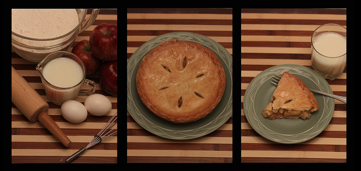
| I absolutely love the tone here - such a wonderful country Americana homey feeling. Excellent lighting - but just a hair underexposed. 8 (would be a 10 if you bumped up the exposure for a little more "pop". |
|
| Photographer found comment helpful. |
|
|
10/25/2009 12:39:57 PM |
| very nicely done -- but it really is quite dark on my screen and the whites are also off... |
|
| Photographer found comment helpful. |
|
|
10/25/2009 12:21:51 PM |
| I like the concerpt and the colours. Perhaps the cropping is a little severe on the apples and the plate. |
|
| Photographer found comment helpful. |
|
|
10/23/2009 01:37:30 PM |
| This looks really yummy. Well done. |
|
| Photographer found comment helpful. |
|
|
10/21/2009 11:31:20 PM |
| the lighting kills this shot, its too flat. Moreover little details like the top of the pictures showing white, and the fact that the stripes are not aligned properly dont help. I personally would like to see the stripes alternating in the second shot with the 1st and 3rd. The view from above is also not too inspiring, as it lacks a 3d impact. |
|
| Photographer found comment helpful. |
|
|
10/21/2009 05:05:59 PM |
| Nice concept. Tells story nicely. Overall, image is a bit dark. |
|
| Photographer found comment helpful. |
|
|
10/21/2009 04:45:02 PM |
| You'll probably get a lot of comments about how this is underexposed.... but I actually like the exact brightness you have here. It seems to somehow enrich the colors. Perhaps just one of them should have a brighter exposure? Clever concept though, and good work. What if the last one had a person eating the pie? |
|
| Photographer found comment helpful. |
|
|
10/21/2009 03:25:20 PM |
| Love the sequence, I have given you a good score, it does strike me as being a little flat. |
|
| Photographer found comment helpful. |
|
|
10/21/2009 12:23:49 PM |
| It's a good composition and it tells the story well, but I find the colours just a little too subdued. |
|
| Photographer found comment helpful. |
|
|
10/21/2009 10:48:26 AM |
| I like the idea, just seems a little dark. Maybe some contrast would bring a little boost to the overall very good picture. |
|
| Photographer found comment helpful. |
|
|
10/21/2009 03:59:22 AM |
| This could use a boost in lightness or exposure - it looks kind of underlit. |
|
| Photographer found comment helpful. |
|
|
10/20/2009 11:56:44 PM |
| well arranged, overall a bit too dark, the slight tilt kind distracts |
|
| Photographer found comment helpful. |
|
|
10/20/2009 11:52:24 PM |
| I like the setting, but I feel the lighting could be improved. |
|
| Photographer found comment helpful. |
|
|
10/20/2009 09:14:32 PM |
| great story! it seems a little dull.. the "whites" show as a little too dark creamy to me. and although i like the stripes as a linking theme in the images, it seems a little overpowering in these. |
|
| Photographer found comment helpful. |
|
|
10/20/2009 08:42:24 PM |
Good thing this wasn't a Quadtych! :P
btw - Excellent job! |
|
| Photographer found comment helpful. |
Home -
Challenges -
Community -
League -
Photos -
Cameras -
Lenses -
Learn -
Help -
Terms of Use -
Privacy -
Top ^
DPChallenge, and website content and design, Copyright © 2001-2025 Challenging Technologies, LLC.
All digital photo copyrights belong to the photographers and may not be used without permission.
Current Server Time: 04/07/2025 09:09:05 PM EDT.