DPChallenge: A Digital Photography Contest You are not logged in. (log in or register
 
Challenge Entries
This image is not a part of any challenge.
Portfolio Images
Short nap
Short nap
Melethia


Photograph Information Photographer's Comments
Collection: Critters and folks
Location: Frankfurt
Date: Sep 20, 2009
Date Uploaded: Oct 3, 2009

Viewed: 232
Comments: 2
Favorites: 0

Rejected at 1x. Overprocessed a bit for my taste with too heavy a vignette. Thoughts?

Please log in or register to add your comments!

AuthorThread
10/04/2009 07:22:41 AM
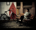
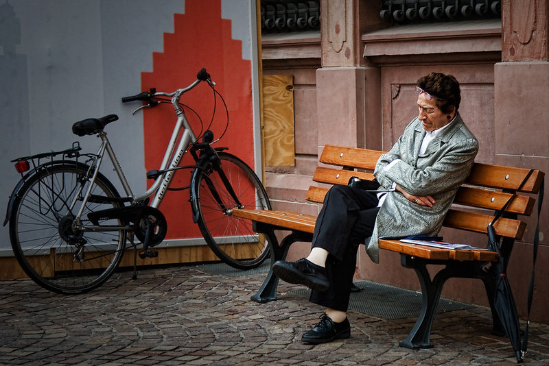
It does look overprocessed, and the vignette doesn't seem to really add much to the image (intrude instead). The frame also seems a bit on the tight side. What kinda "bothers" me most in this one is that the story seems rather weak (or confused?). There's the man, supposedly napping, and the bike, and a bunch of prominent architectural elements (brick road, bench, decorative wall, ironwork, plus grates and plywood). In particular, what do the man and the bike have to do with each other, or, why are they together in this picture? The way the picture is framed, it would seem there's a reason for it, but it is not apparent (to me). The angle you used, also, eye-level, is a bit uninspired.

So to answer your question in the thread, is it worth reworking. Well, I would say probably not. It's quite a beautiful snap, much better than your average snap, but it still is a snap. And I don't mean that at all to offend, it is just my assessment on how it might be perceived at an art photography site.
  Photographer found comment helpful.
10/03/2009 07:03:26 AM
I think the vignette hurts more than helps. It just seems to wash out the colors--especially since they are trying to be bright and saturated otherwise.

I tried a B/W conversion to test that theory. I still think it might be a little too much, but without colors for it to wash out, it wasn't so noticeable.

Next, I tried dodging it to remove the vignette altogether. I think I prefer it without.

The bit of plywood on the wall is unattractive and doesn't really fit with the rest of the building materials.

The subject looks to be in pain more so than sleeping. lol

I like how the bench and the suffering sleeper form an "X." I also like the way the umbrella (?) fits into the frame. I'm not so sure about the placement of the bicycle--it and the grimacing napper seem to draw a straight line across the picture.

Did I mention that the subject looks to be in pain?

Should you resubmit to 1x? It doesn't really strike me as something they would publish. Maybe add an overlay and/or use that anguished expression to your advantage. But then again, what do I know?

Well, anyway, that's my $0.02.
  Photographer found comment helpful.


Home - Challenges - Community - League - Photos - Cameras - Lenses - Learn - Help - Terms of Use - Privacy - Top ^
DPChallenge, and website content and design, Copyright © 2001-2025 Challenging Technologies, LLC.
All digital photo copyrights belong to the photographers and may not be used without permission.
Current Server Time: 04/08/2025 03:13:37 AM EDT.