| Author | Thread |
|
|
10/12/2009 03:37:24 AM |
|
 Photographer found comment helpful. Photographer found comment helpful. |
Comments Made During the Challenge  |
|
|
10/07/2009 09:46:24 PM |
| Very effectively composed. |
|
| Photographer found comment helpful. |
|
|
10/07/2009 09:27:10 PM |
|
| Photographer found comment helpful. |
|
|
10/07/2009 09:01:50 PM |
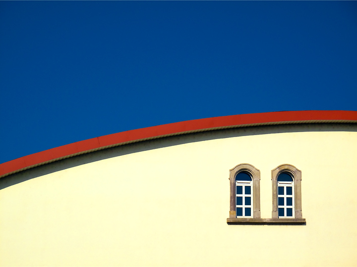
| I like these sort of shots. I think of them as semi-abstract. You can readily tell what they are, but they are photographed in an abstract manner. |
|
| Photographer found comment helpful. |
|
|
10/07/2009 02:17:11 PM |
| Nice minimalism.....love the clean aspect of the image.....8 |
|
| Photographer found comment helpful. |
|
|
10/06/2009 09:45:43 PM |
| This is simplicity at its best! My favourite from this challenge. A good example how primaries make strong image. |
|
| Photographer found comment helpful. |
|
|
10/06/2009 03:39:57 AM |
| Cool composition! I hope to see it among the winner! |
|
| Photographer found comment helpful. |
|
|
10/04/2009 09:32:22 PM |
| I love the simplicity.... Very clean lines.... and bold colors. GREAT |
|
| Photographer found comment helpful. |
|
|
10/04/2009 07:55:47 PM |
| So simple yet so striking. |
|
| Photographer found comment helpful. |
|
|
10/04/2009 12:49:26 PM |
| I would have liked the blue to be 1/3 rather than 1/2 the image |
|
| Photographer found comment helpful. |
|
|
10/04/2009 08:10:34 AM |
| Beautiful and simple, balanced and sharp. Only one gripe: the vertical/horizontal is off just a touch. |
|
| Photographer found comment helpful. |
|
|
10/04/2009 01:58:22 AM |
| Very simple but effective.. great colors and the curves make it more appealing than a straight line would have.. |
|
| Photographer found comment helpful. |
|
|
10/03/2009 02:24:43 PM |
| I like the composition....but, is the yellow actually that light? It looks like it may be a bit blown out...It would have been nice to see a deeper yellow in the building to add more contrast in color |
|
| Photographer found comment helpful. |
|
|
10/03/2009 05:18:27 AM |
OK, I'm going through the Free Study submissions, purposefully finding those images I think are shot with a less conventional eye - this is one of those images! Thanks for offering something that isn't just DPC friendly eye-candy (though of course there's nothing wrong with eye-candy). I'll be picking one of these images for my Mu (most underrated) award:
Positives: Sometimes in the comment series I comment on an image that has wider than 'just' niche appeal - I think this image begins to stray into that area. What hits me about this image is its purity, so clean uncluttered. I like the way you haven't been tempted to ramp up the saturation on the red and yellow - I'm not sure I would've made nearly such a sensible editing choice; there is a lesson for me right there. The composition is fantastic - so well balanced.
Critical stuff: Nothing much but perhaps my heavy-handed editing might have been tempted to send the window panes to black just to pick up the contrast of this area.
Overall: Incredibly effective image - expertly executed. |
|
| Photographer found comment helpful. |
|
|
10/02/2009 01:08:55 PM |
| this is bold. i think it's well balanced and the two windows are interesting but i'm not loving it. 6 for now |
|
| Photographer found comment helpful. |
|
|
10/02/2009 09:26:44 AM |
|
| Photographer found comment helpful. |
|
|
10/02/2009 09:21:30 AM |
so simple but so effective. perfect composition
8 |
|
| Photographer found comment helpful. |
|
|
10/01/2009 04:26:54 PM |
| Perfectly done. Simple, yet intense. (not voting) |
|
| Photographer found comment helpful. |
|
|
10/01/2009 02:51:14 PM |
| Brilliant use of colors and great elements of design. Excellent composition. |
|
| Photographer found comment helpful. |
Home -
Challenges -
Community -
League -
Photos -
Cameras -
Lenses -
Learn -
Help -
Terms of Use -
Privacy -
Top ^
DPChallenge, and website content and design, Copyright © 2001-2026 Challenging Technologies, LLC.
All digital photo copyrights belong to the photographers and may not be used without permission.
Current Server Time: 02/01/2026 09:16:37 AM EST.