| Author | Thread |
|
|
10/08/2009 07:47:26 AM |
I would be interested to know what PP you did on this (if any). The buildings at the bottom look slightly odd somehow.
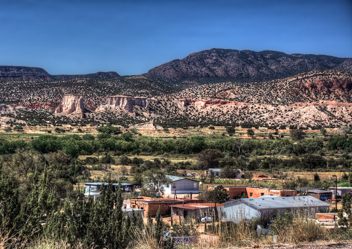
But for me, the biggie is the wide, very bright strip of reddish cliff across the centre. It drags my eye away from your subject and straight across the middle of the picture, which is not where I want my eye to be (the pueblo). The top and bottom are both darker.
Just my thoughts - no intention to offend. And I didn't vote, since I did have a horse in this race which also didn't do great! |
|
 Photographer found comment helpful. Photographer found comment helpful. |
|
|
10/08/2009 04:46:33 AM |
I didnt vote on the free study, but I can tell you what I think went wrong on this photo.
First the photo is too busy. Too much going on and no one strong focus point.
My eye seems to struggle between the mountain and the pueblo. The mountain seems to be stronger and I catch myself going in that direction most of the time.
As far as processing, there is nothing wrong with this photo. Just the composition is not as strong as it should be.
Too much in the photo and the mountain overpowers the pueblo.
I hope this helps |
|
| Photographer found comment helpful. |
|
|
10/07/2009 10:04:39 PM |
| Well I voted this image a 5, and I'll do my best to explain why, hopefully without offending. I thought that it was quite bland, (in comparison to others in the challenge) and I agree that it lacks a clear point of interest. I couldn't decide if the town was the focus, or the landscape the focus. In your 'about' you mention, showing the poverty, but from this perspective, as a viewer, it's not possible to tell about the poverty, perhaps if you had moved in closer to the sign, you may have captured some elements that show that story more clearly....that would then be the point of interest... Alternatively if the landscape is the focus, then I would have moved much closer, to that fabulous escarpment and picked one element, and tried to make it stand out from the surrounds. Of course clouds always seem to help in a DPC friendly landscape...LOL! I have no suggestions on how to fix that problem, but if you find a way, then please share... and I suggest that you do what I did before I commented... have a look at the landscapes on the front page of the FS Challenge, and try and work out why these images stand out. Having said all of that, I think you did a good job of processing, and I'm extremely envious of your fabulously unique location, and I look forward to seeing more of it...... |
|
| Photographer found comment helpful. |
|
|
10/07/2009 08:56:35 PM |
| I think the composition does not lead the eye through the frame very well. The homes at the bottom edge of the frame are widely separated from the mountains. None of the mountains themselves stand out as the focal point either. Perhaps overhead midday sun was a secondary issue. Your post processing of this was good, however. You got some nice colors and maximum possible detail out of this. I gave this a 6, for what you did accomplish with it. |
|
| Photographer found comment helpful. |
|
|
10/07/2009 08:32:44 PM |
I think it lacks a clear point of interest. I like it more without the village, maybe you should have cropped it out. Also being a landscape with the sky on it, a more dramatic sky with detailed clouds would make it score higher, I guess. I'm curious to see a version of the same photo without the village and a darker look.
Free Studies are tough anyway(and I still insanely insist on participating on them). |
|
| Photographer found comment helpful. |
Comments Made During the Challenge  |
|
|
10/01/2009 11:56:37 AM |
| It's hard to make something with this much detail - and busy detail at that! - work at a DPC size, and yet you have done a marvelous job here. Really shows off the countryside well. |
|
| Photographer found comment helpful. |