| Author | Thread |
Comments Made During the Challenge  |
|
|
10/04/2009 10:35:14 AM |
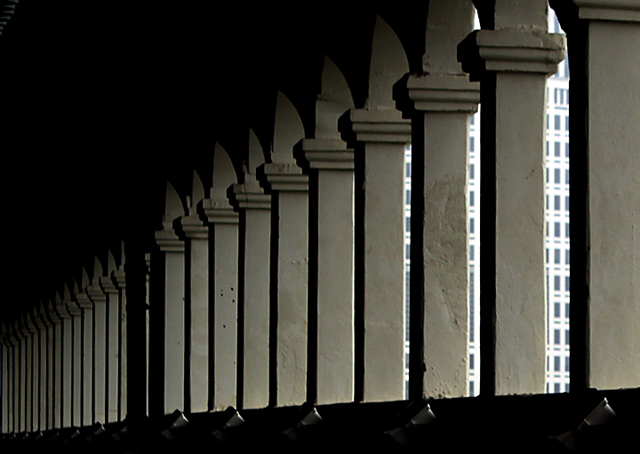
| Nice image and good composition. I would like to see a bit more contrast between the supports and the darker portions of the image. I really like the negative space in the upper left of the image but not sure I can say the same about the bottom of the image. |
|
 Photographer found comment helpful. Photographer found comment helpful. |
|
|
10/02/2009 07:42:34 PM |
| Very nice columns! Wish you could see a touch more detail in the texture, but that's not a deal breaker! I like this. |
|
| Photographer found comment helpful. |
|
|
10/02/2009 07:08:25 PM |
|
| Photographer found comment helpful. |
|
|
10/02/2009 04:29:09 PM |
| I like the lines, and how the upper left portion of the photo draws my eyes down to the lighted part and lines. |
|
| Photographer found comment helpful. |
|
|
09/30/2009 09:58:10 PM |
| Love the repetition. The top left black steals a bit of it though. There are subtle non-straight lines there (the arches between columns) which might hit it hard scorewise. |
|
| Photographer found comment helpful. |
|
|
09/30/2009 03:25:35 AM |
| I love the light here. The building beyond is just a tad jarring, but then you realize that adds even more to the solitude here under the bridge. |
|
| Photographer found comment helpful. |
Home -
Challenges -
Community -
League -
Photos -
Cameras -
Lenses -
Learn -
Help -
Terms of Use -
Privacy -
Top ^
DPChallenge, and website content and design, Copyright © 2001-2025 Challenging Technologies, LLC.
All digital photo copyrights belong to the photographers and may not be used without permission.
Current Server Time: 04/09/2025 08:55:22 PM EDT.