| Author | Thread |
Comments Made During the Challenge  |
|
|
09/22/2009 03:03:19 PM |
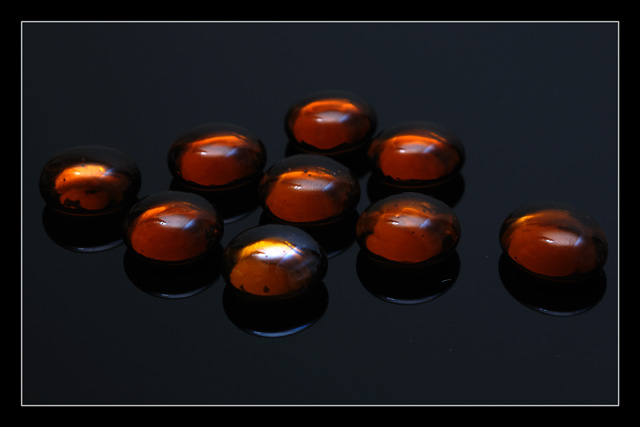
| Nice set up, although I the front one being a little separated is slightly visually disturbing to me for some reason. |
|
 Photographer found comment helpful. Photographer found comment helpful. |
|
|
09/19/2009 06:39:08 PM |
| The reflections are distracting. I'm not really sure what I see because of this. |
|
| Photographer found comment helpful. |
|
|
09/18/2009 03:32:40 PM |
| Very nice use of light to show the roundness of the top of the subject. Nice earth tones I also like the use of the reflection. |
|
| Photographer found comment helpful. |
|
|
09/16/2009 09:38:16 PM |
| good concept. may have arranged the 'drops' in a more catchy way |
|
| Photographer found comment helpful. |
|
|
09/16/2009 11:51:19 AM |
I can't put my finger on it but the subject of this shot is unappealing to me. Something about the color cast puts me off.
I like the reflections underneath and I like that the one in front has the light reflecting from it. If the other one in the same row (far left) didn't also have a lighter hue to it I think it would have made the front drop stand out and that might have been more interesting.
I think the frame helps this kind of shot and like it here. |
|
| Photographer found comment helpful. |
|
|
09/16/2009 12:21:31 AM |
| For this one to draw high numbers, I think you'd need crisp focus throughout the entire image. The objects in the back of the image seem to fade into softness and loss of detail. Interesting subjects, but I thin a little more exposure would help give this one some pop as well. 5. |
|
| Photographer found comment helpful. |
Home -
Challenges -
Community -
League -
Photos -
Cameras -
Lenses -
Learn -
Help -
Terms of Use -
Privacy -
Top ^
DPChallenge, and website content and design, Copyright © 2001-2025 Challenging Technologies, LLC.
All digital photo copyrights belong to the photographers and may not be used without permission.
Current Server Time: 04/15/2025 12:02:33 AM EDT.