| Author | Thread |
|
|
08/26/2009 11:22:40 AM |
|
Comments Made During the Challenge  |
|
|
08/25/2009 08:53:43 PM |
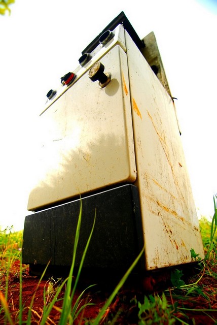
| interesting POV....funny title |
|
|
|
08/25/2009 02:13:31 PM |
| LOL! this is unique! Maybe a touch less contrast as the left side of the front door is blown out and you've got the cyan blob in the upper right sky. Still a really fun concept. |
|
|
|
08/24/2009 02:22:41 PM |
| What a cool, old stove... Nice title! Great catch. |
|
|
|
08/23/2009 03:48:41 PM |
| I like the angle you choose, and the vibrant colors on the ground, but the light on the left is too harsh, IMO. Maybe one stop darker would give you a better result. |
|
|
|
08/23/2009 12:30:21 AM |
| I love the low angle and grungy feel to this shot, but the blown out highlights detract from the final product. |
|
|
|
08/22/2009 08:03:57 PM |
The first thing that jumps at me is the warped angle, which i like! Its different. 2nd thing is wtf is this doing out in the wild? So kudos on the unique image. Aside from the obvious imperfections on the top corners and the blown out side of the oven this is a nice image.
Title is also witty and compliments the image. |
|
|
|
08/22/2009 10:51:56 AM |
| I like the perspective here, but with the highkey kinda blown background area's I think this might look a little better in B&W. |
|
|
|
08/22/2009 12:08:39 AM |
| interesting idea. Your colors seem to be rather oversaturated. Undersaturating, or even b&w with sepia might give it an even more "used up" feel. |
|
|
|
08/21/2009 06:01:33 PM |
| Wonderful imposing angle. I like the colors too. |
|
|
|
08/21/2009 04:29:38 PM |
| I see what you were going for here with the extreme angle, but the contrast between the reddish ground and the blown out sky does not work for me. The rsty textures are cool. |
|
|
|
08/21/2009 02:28:09 PM |
| blown out on the left is hurting this |
|
|
|
08/21/2009 12:07:55 PM |
| Nice p.o.v...this one is different...7 |
|
|
|
08/19/2009 05:14:13 PM |
| I love the angle view point. I adds a great feel for it. |
|
|
|
08/19/2009 12:26:21 PM |
| I'm liking the perspective but not so much the blown out parts. Thats just my opinion because it still works well as an image I think. |
|
|
|
08/19/2009 04:43:36 AM |
| Great angle, but the whites are a little too blown out for me. |
|
|
|
08/19/2009 03:42:16 AM |
| that blue corner is a pitty, could have been an 8, 7 |
|
Home -
Challenges -
Community -
League -
Photos -
Cameras -
Lenses -
Learn -
Help -
Terms of Use -
Privacy -
Top ^
DPChallenge, and website content and design, Copyright © 2001-2026 Challenging Technologies, LLC.
All digital photo copyrights belong to the photographers and may not be used without permission.
Current Server Time: 02/01/2026 11:24:42 AM EST.