| Author | Thread |
Comments Made During the Challenge  |
|
|
06/07/2004 12:32:42 PM |
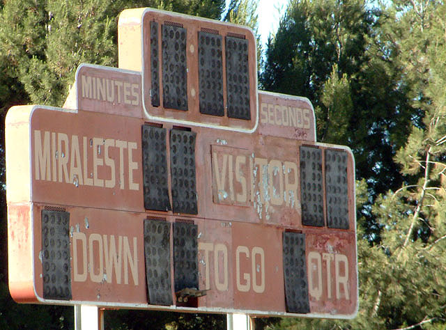
| Wow, if this sign is still in use, time to get the booster club in gear... Neat photo, but seems a little washed out overall. |
|
 Photographer found comment helpful. Photographer found comment helpful. |
|
|
06/06/2004 06:44:30 PM |
| The color seems a little dull - a little more saturation - or perhaps returing in the morning or late evening - the light here is a little flat. Good concept though, |
|
| Photographer found comment helpful. |
|
|
06/04/2004 06:33:54 PM |
|
|
|
06/03/2004 11:01:11 AM |
| This seems very faded adn the saturation isn't that striking (even with teh trees in behind). I'm wondering if maybe your software program is drawing colours away from your image when you resize. The muted colours in the sign may have looked really cool if the background trees were really bright and rich in colours. It's well cmoposed though. -6 |
|
| Photographer found comment helpful. |
|
|
06/02/2004 11:26:50 AM |
|
| Photographer found comment helpful. |
|
|
06/02/2004 06:43:18 AM |
| The idea is very good. I think this would of benefited from less sunlight. Just a bit too pale. |
|
| Photographer found comment helpful. |
|
|
06/01/2004 09:26:56 PM |
| Well thought of, well planned and to me, your effort of finding this scoreboard to illustrate your vision is quite exemplary. Your picture tells a lot of story. |
|
| Photographer found comment helpful. |
Home -
Challenges -
Community -
League -
Photos -
Cameras -
Lenses -
Learn -
Help -
Terms of Use -
Privacy -
Top ^
DPChallenge, and website content and design, Copyright © 2001-2025 Challenging Technologies, LLC.
All digital photo copyrights belong to the photographers and may not be used without permission.
Current Server Time: 04/08/2025 01:33:12 AM EDT.