| Author | Thread |
Comments Made During the Challenge  |
|
|
06/03/2004 06:34:24 PM |
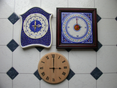
| The lighting is a bit low for this type of shot. I think a closer crop of the clocks, maybe less organized in position, might work well. I'm not too fond of the backdrop (checkered floor). The reflections on the top are prevalent and the black squares detract from your main subject. |
|
 Photographer found comment helpful. Photographer found comment helpful. |
|
|
06/03/2004 01:31:33 AM |
| This is a good idea but the background is destracting maybe a black or plain background would show them up more Good luck |
|
| Photographer found comment helpful. |
|
|
06/01/2004 10:13:25 AM |
| Interesting selection of subjects. I would have liked a sharper focus and focal point of interest I think. |
|
| Photographer found comment helpful. |
|
|
05/31/2004 04:06:18 AM |
| uh oh - it is going to be way too tempting to give out threes in this challenge - sort of subliminal advertising - lighting ia awful flat - the idea is great but the photo is not - 4 |
|
| Photographer found comment helpful. |
|
|
05/30/2004 09:21:55 PM |
| This is awesome. My only comment is that there's a bit of a glare -almost looks washed out - in the left corner (at least from my monitor). I'm not sure how this could be corrected - I can tell your white balance looks dead on. Maybe moving the light a bit in the future would help. Good luck! |
|
| Photographer found comment helpful. |
Home -
Challenges -
Community -
League -
Photos -
Cameras -
Lenses -
Learn -
Help -
Terms of Use -
Privacy -
Top ^
DPChallenge, and website content and design, Copyright © 2001-2025 Challenging Technologies, LLC.
All digital photo copyrights belong to the photographers and may not be used without permission.
Current Server Time: 04/09/2025 07:34:59 PM EDT.