| Author | Thread |
|
|
06/23/2009 05:54:11 AM |
Greetings from the Critique Club :)
Composition:
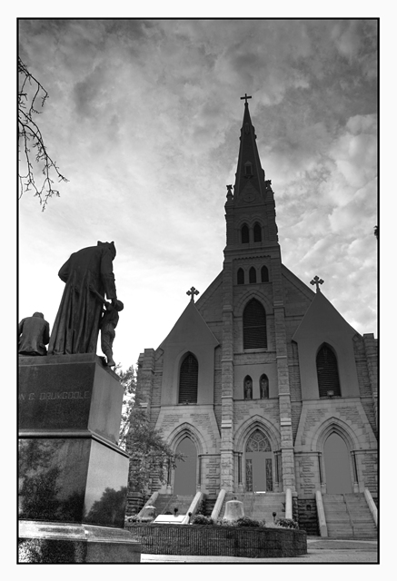
I quite liked this in voting although the wide angle distortion works in some areas and detracts from others, for example I love the way the statue leans in to the shot but find the way the church leans is a bit awkward (can't have the best of both worlds though I guess heh). I think compositionally it works overall though, but as mentioned by those that have left comments the shadow (I am assuming you used an NDGrad?) on the building really detracts from the image and that's a shame as I think you had a cracking shot without it.
Technicals:
Other than the grad nothing really jumps out as a problem, it's well focused has a nice DOF.
Post-Processing:
I raelly like the tones in the lower half of the church and I suspect had they been consistent throughout that this would have placed much higher, the only thing I might have changed as it stands is to crop a tad more on the right and lose that tiny bit of tree.
My Opinion:
Nice crisp picture let down a lot by the dark area mentioned (so many times before sorry), nice composition and a rather nice feeling of depth from front to back.
Hope this was of some use, should you wish to discuss any part of the critique further please feel free to PM me.
Good luck in future challenges!
Mark |
|
 Photographer found comment helpful. Photographer found comment helpful. |
Comments Made During the Challenge  |
|
|
06/14/2009 02:38:54 PM |
| This is a nice shot, but the darkened church top (from a graduated filter?) really detracts... |
|
| Photographer found comment helpful. |
|
|
06/11/2009 08:18:01 PM |
| i like the angle and the sky... i wish the church didn't have the shadow across the top... |
|
| Photographer found comment helpful. |
|
|
06/10/2009 12:08:58 PM |
| The huge shadow at the top of the church is distracting |
|
| Photographer found comment helpful. |
Home -
Challenges -
Community -
League -
Photos -
Cameras -
Lenses -
Learn -
Help -
Terms of Use -
Privacy -
Top ^
DPChallenge, and website content and design, Copyright © 2001-2025 Challenging Technologies, LLC.
All digital photo copyrights belong to the photographers and may not be used without permission.
Current Server Time: 04/08/2025 06:34:24 AM EDT.