| Author | Thread |
Comments Made During the Challenge  |
|
|
05/18/2009 09:26:37 AM |
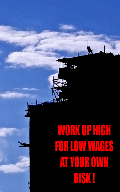
| I like the silhuetted building but I feel that the only thing to look at here is the red text. |
|
 Photographer found comment helpful. Photographer found comment helpful. |
|
|
05/17/2009 01:17:05 PM |
Cool shot! The lettering breaks up the building, I think, lessening the impact of how wonderful that negative space is.
I would have left it blank and put the lettering in a different color on a border instead.
Nice and sharp. Incredibly so. Not voting yet. |
|
| Photographer found comment helpful. |
|
|
05/16/2009 04:12:07 PM |
| good text but sky and building seem to be from different pix and red text takes up too much space i think. too much pure black dead space in my opinion... |
|
| Photographer found comment helpful. |
|
|
05/15/2009 07:05:30 PM |
| A great poster layout and good silhouetted shot. Well done. |
|
| Photographer found comment helpful. |
|
|
05/15/2009 01:55:04 PM |
been there, done that .. got hurt,
Strong message which I totally agree with, I like the composition as well, the red adds a flavor that can't be denied to this picture, very well done,
10 |
|
| Photographer found comment helpful. |
Home -
Challenges -
Community -
League -
Photos -
Cameras -
Lenses -
Learn -
Help -
Terms of Use -
Privacy -
Top ^
DPChallenge, and website content and design, Copyright © 2001-2026 Challenging Technologies, LLC.
All digital photo copyrights belong to the photographers and may not be used without permission.
Current Server Time: 02/01/2026 11:46:04 AM EST.