| Author | Thread |
Comments Made During the Challenge  |
|
|
05/12/2009 06:05:35 PM |
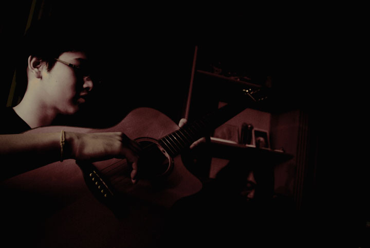
| Well lit subject. The line of the shelving is a little distracting especially as it appears to be leaning to the right. |
|
|
|
05/12/2009 05:03:07 PM |
| This subject requires more lighting and contrast to bring out the skin tones and the texture of the instrument. I also think a third of the right side could easily have been cropped for tighter composition. |
|
|
|
05/07/2009 05:57:25 PM |
| Less interesting that it could be, it seems overly under saturated and rather flat. A suggestion would be to examine the histogram and see where the major colors lie in relation to other aspect of the image. Given the subject and title, this could have been a huge success if more tought had been given to composition, exposure and presentation. This might have worked much better exposed to the criteria of the zone system and presented as a black and white. |
|
|
|
05/05/2009 09:28:36 PM |
|
Home -
Challenges -
Community -
League -
Photos -
Cameras -
Lenses -
Learn -
Help -
Terms of Use -
Privacy -
Top ^
DPChallenge, and website content and design, Copyright © 2001-2025 Challenging Technologies, LLC.
All digital photo copyrights belong to the photographers and may not be used without permission.
Current Server Time: 04/08/2025 03:04:15 AM EDT.