| Author | Thread |
Comments Made During the Challenge  |
|
|
06/01/2004 02:25:56 PM |
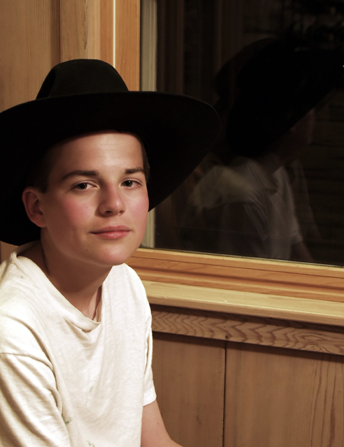
| This is almost perfectly lit. I like the fact that there is reduced detail in the dark hat, yet there is some detail in the shirt. I also like the reflections in the glass, as I think they really add some depth to the picture. The detail on the paneling probably looks great on your wall, but just isn't helping this otherwise great shot as it distracts from the subject. |
|
 Photographer found comment helpful. Photographer found comment helpful. |
|
|
05/31/2004 12:39:17 PM |
Ummm, it's a relection,not a shadow :-)...
Nice portrait though, I would have tired to get less light on the wall, as it competes quite a bit with your model, either that or try for a very shallow DOF. Go further back, zoom in and use the largest appeture you can... Lesss light on the wall would have enhanced the relection as well. |
|
| Photographer found comment helpful. |
|
|
05/27/2004 03:17:09 AM |
|
| Photographer found comment helpful. |
|
|
05/26/2004 03:59:36 PM |
| would have got closer and concentrated on his face |
|
| Photographer found comment helpful. |
|
|
05/26/2004 03:29:13 PM |
| How is this obvious use of multiple light sources and how is that use a key factor in your composition? |
|
Home -
Challenges -
Community -
League -
Photos -
Cameras -
Lenses -
Learn -
Help -
Terms of Use -
Privacy -
Top ^
DPChallenge, and website content and design, Copyright © 2001-2025 Challenging Technologies, LLC.
All digital photo copyrights belong to the photographers and may not be used without permission.
Current Server Time: 04/08/2025 08:01:24 AM EDT.