| Author | Thread |
|
|
04/21/2009 09:08:25 PM |
Greetings from the Critique Club!
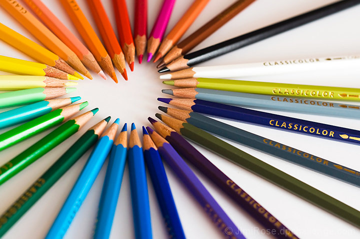
Initial impression: I enjoy looking at this shot. The composition is pleasing, the colours are saturated but not overdone. I can see why some aren't crazy about the brand name on the pencils, but I find the eye does start looking for it and does create some flow. Had I voted I would have given this a 6.
Technical: I would try to get more light from the left, either with a reflector or second light. I'd like to see more dof too to include the points forming the upper right curve of the heart. ISO seems a little high for a still life.
Artistic: That white pencil does detract because it's right between the black, which is oof, and the chartreuse, which is in focus. I think without the black and white you could've made a smaller, tighter shape.
If you have any questions please feel free to PM me.
Susan |
|
 Photographer found comment helpful. Photographer found comment helpful. |
Comments Made During the Challenge  |
|
|
04/18/2009 10:31:37 PM |
| Very cool i like it. I like how its not right in the center. Gives more to the picture I think. |
|
| Photographer found comment helpful. |
|
|
04/18/2009 10:39:14 AM |
| i like the angle you used here. too bad the white pencil is blending in so much |
|
| Photographer found comment helpful. |
|
|
04/15/2009 05:57:04 AM |
| I like how you formed the heart in the middle, but without over-emphasizing it - trusting that the viewer would be able to see the composition. well done. |
|
| Photographer found comment helpful. |
|
|
04/14/2009 07:55:01 AM |
| this is totally picky...but I like the shots that don't show the printed name on the pencils better...just the rainbow of colors only....mind you I don't dislike your shot...it is just a observation on my part |
|
| Photographer found comment helpful. |
|
|
04/14/2009 06:11:53 AM |
| Neat shot. Only crayon that looks out of place and is distracting is the white one being on a white background. Maybe a dark background would have worked better without the black colouring pencil. |
|
| Photographer found comment helpful. |
|
|
04/13/2009 01:36:36 PM |
| The image meets the subject matter dead on. A sound demonstration of the creative process in meeting the challenge in a very unusual way. A couple of minor detail problems as the image appears to be less than sharp. The DOF could have been used more effectively. A good solid entry into the challenge. |
|
| Photographer found comment helpful. |
|
|
04/13/2009 12:49:34 PM |
| great shot . How long did it take you to get them lined up so perfectly ???? |
|
| Photographer found comment helpful. |
|
|
04/13/2009 05:20:32 AM |
| Nice simple shot, a different colored background may have been better here JMO. |
|
| Photographer found comment helpful. |
|
|
04/12/2009 08:16:45 PM |
|
| Photographer found comment helpful. |
Home -
Challenges -
Community -
League -
Photos -
Cameras -
Lenses -
Learn -
Help -
Terms of Use -
Privacy -
Top ^
DPChallenge, and website content and design, Copyright © 2001-2025 Challenging Technologies, LLC.
All digital photo copyrights belong to the photographers and may not be used without permission.
Current Server Time: 04/07/2025 01:01:50 AM EDT.