| Author | Thread |
Comments Made During the Challenge  |
|
|
04/21/2009 08:08:32 PM |
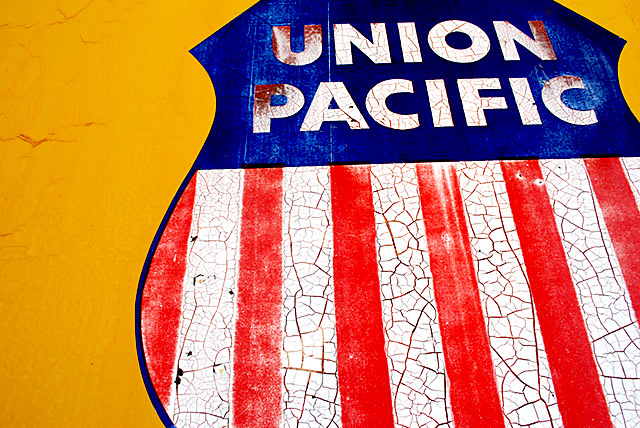
| I like the cracking and color |
|
 Photographer found comment helpful. Photographer found comment helpful. |
|
|
04/19/2009 05:41:15 PM |
| A unique and different look at the challenge subject, this is a perfect concept executed in fine fashion. A technical and artistic success with nothing to critique or call as a major, or even minor, flaw. This should be a ribbon winner as it's very unique and well presented. |
|
| Photographer found comment helpful. |
|
|
04/19/2009 07:17:29 AM |
| I thinking a tighter crop would have work on this shot, and fix the tilt a little bit. JMO! |
|
| Photographer found comment helpful. |
|
|
04/18/2009 10:46:54 AM |
| nice and simple, lots of dpc-friendly saturation too! 7 |
|
| Photographer found comment helpful. |
|
|
04/18/2009 07:02:32 AM |
| Good color. Not sure about your vert and horiz. I see the 1st full stripe on the left is vert, but then your lettering on top is off. How does it look if you set your letters horiz and let the stripes fall where they may... |
|
| Photographer found comment helpful. |
|
|
04/16/2009 09:27:11 AM |
| Great colors and fun texture, but I think the composition would be stronger with maybe only half the UP sign included and if the lines were straight. |
|
| Photographer found comment helpful. |
|
|
04/16/2009 01:36:03 AM |
| Nice color and texture. Definitely eye catching in the thumbnails! Would make a great print. |
|
| Photographer found comment helpful. |
Home -
Challenges -
Community -
League -
Photos -
Cameras -
Lenses -
Learn -
Help -
Terms of Use -
Privacy -
Top ^
DPChallenge, and website content and design, Copyright © 2001-2026 Challenging Technologies, LLC.
All digital photo copyrights belong to the photographers and may not be used without permission.
Current Server Time: 02/01/2026 08:14:50 AM EST.